# load packages
library(tidyverse)
library(countdown)
library(palmerpenguins)
library(ggrepel)
library(here)
library(waffle)
library(scales)

# set theme for ggplot2
ggplot2::theme_set(ggplot2::theme_minimal(base_size = 14))

# set width of code output
options(width = 65)

# set figure parameters for knitr
knitr::opts_chunk$set(
  fig.width = 7,        # 7" width
  fig.asp = 0.618,      # the golden ratio
  fig.retina = 3,       # dpi multiplier for displaying HTML output on retina
  fig.align = "center", # center align figures
  dpi = 300             # higher dpi, sharper image
)

# read in tucsonHousing.csv
tucsonHousing <- read_csv(here(
"slides", "01", "data" ,"tucsonHousing.csv"))Deep dive into ggplot2 layers - II
Lecture 2
University of Arizona
INFO 526
Setup
From last time
tucsonHousing <- tucsonHousing |>
  mutate(
    decade_built = (year_built %/% 10) * 10,
    decade_built_cat = case_when(
      decade_built <= 1950 ~ "1950 or before",
      decade_built >= 2000 ~ "2000 or after",
      TRUE ~ as.character(decade_built)
    )
  )

mean_area_decade <- tucsonHousing |>
  group_by(decade_built_cat) |>
  summarise(mean_area = mean(area))
Geoms
Geoms
Geometric objects, or geoms for short, perform the actual rendering of the layer, controlling the type of plot that you create
You can think of them as “the geometric shape used to represent the data”
One variable
Discrete:
geom_bar(): display distribution of discrete variable.
Continuous
geom_histogram(): bin and count continuous variable, display with barsgeom_density(): smoothed density estimategeom_dotplot(): stack individual points into a dot plotgeom_freqpoly(): bin and count continuous variable, display with lines
Aside
Always use “typewriter text” (monospace font) when writing function names, and follow with (), e.g.,
geom_freqpoly()mean()lm()
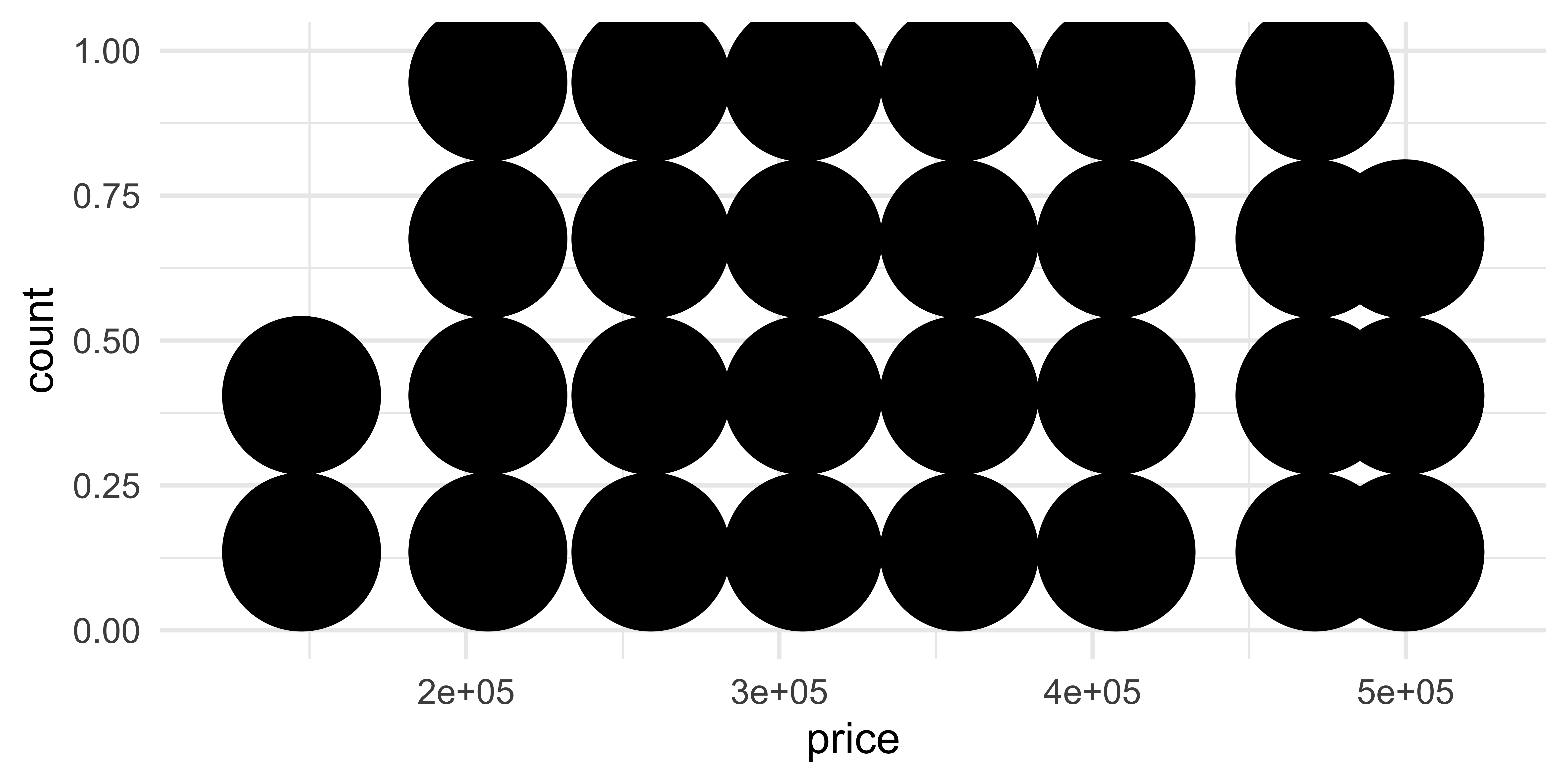
geom_dotplot()
What does each point represent? How are their locations determined? What do the x and y axes represent?
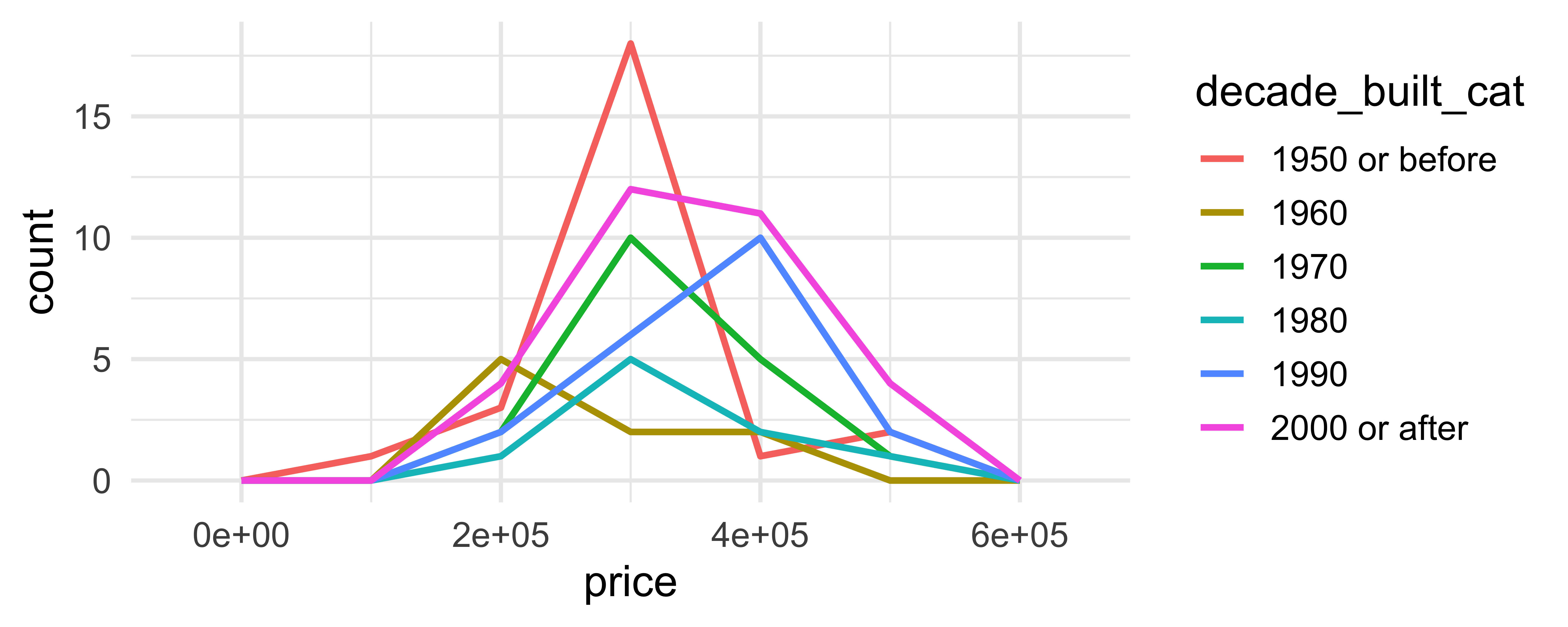
Comparing across groups
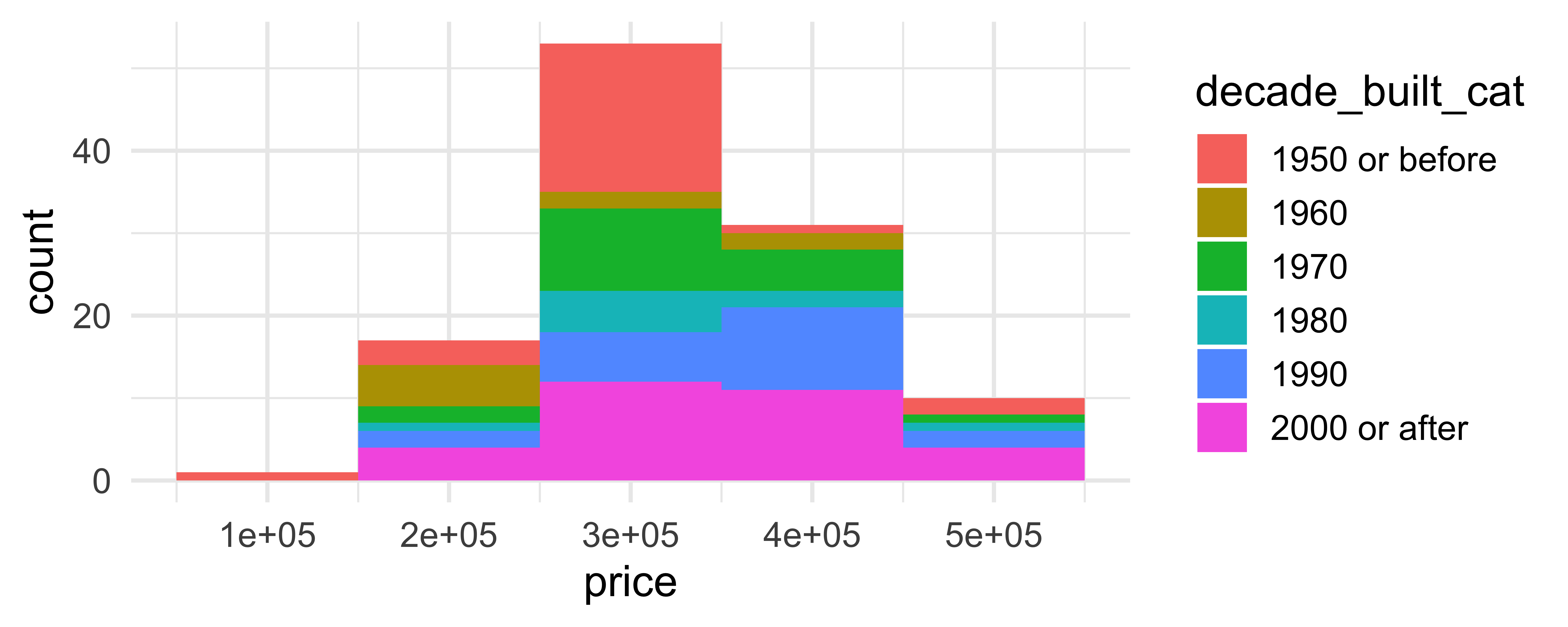
Which of the following allows for easier comparison across groups?
Two variables - both continuous
geom_point(): scatterplotgeom_quantile(): smoothed quantile regressiongeom_rug(): marginal rug plotsgeom_smooth(): smoothed line of best fitgeom_text(): text labels
Two variables - show density
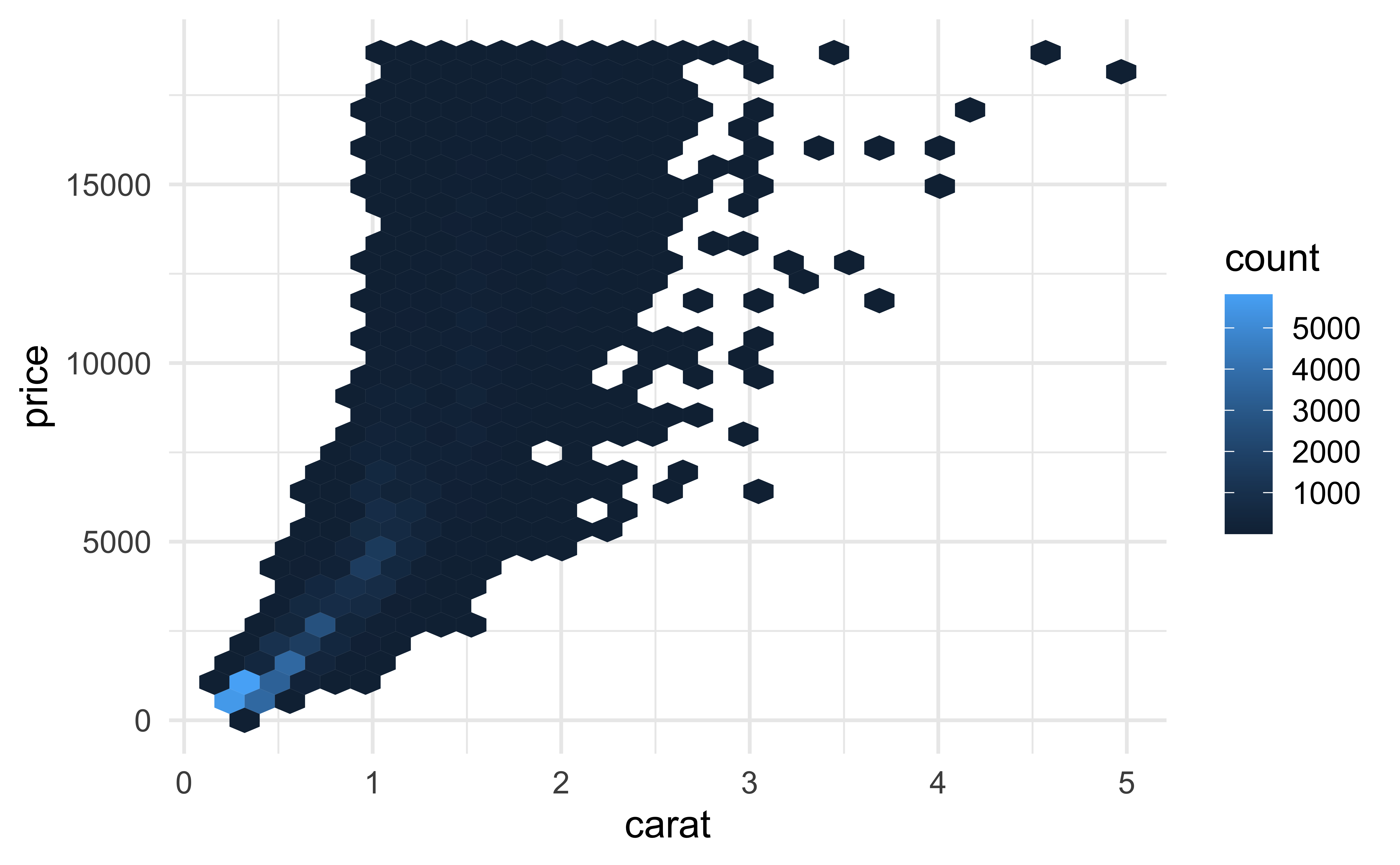
geom_bin2d(): bin into rectangles and countgeom_density2d(): smoothed 2d density estimategeom_hex(): bin into hexagons and count
geom_hex()
Not very helpful for 112 observations:

geom_hex()
More helpful for 53940 observations:
geom_hex() and warnings
- Requires installing the hexbin package separately!
- Otherwise you might see
Warning: Computation failed in `stat_binhex()`Two variables
At least one discrete
geom_count(): count number of point at distinct locationsgeom_jitter(): randomly jitter overlapping points
One continuous, one discrete
geom_col(): a bar chart of pre-computed summariesgeom_boxplot(): boxplotsgeom_violin(): show density of values in each group
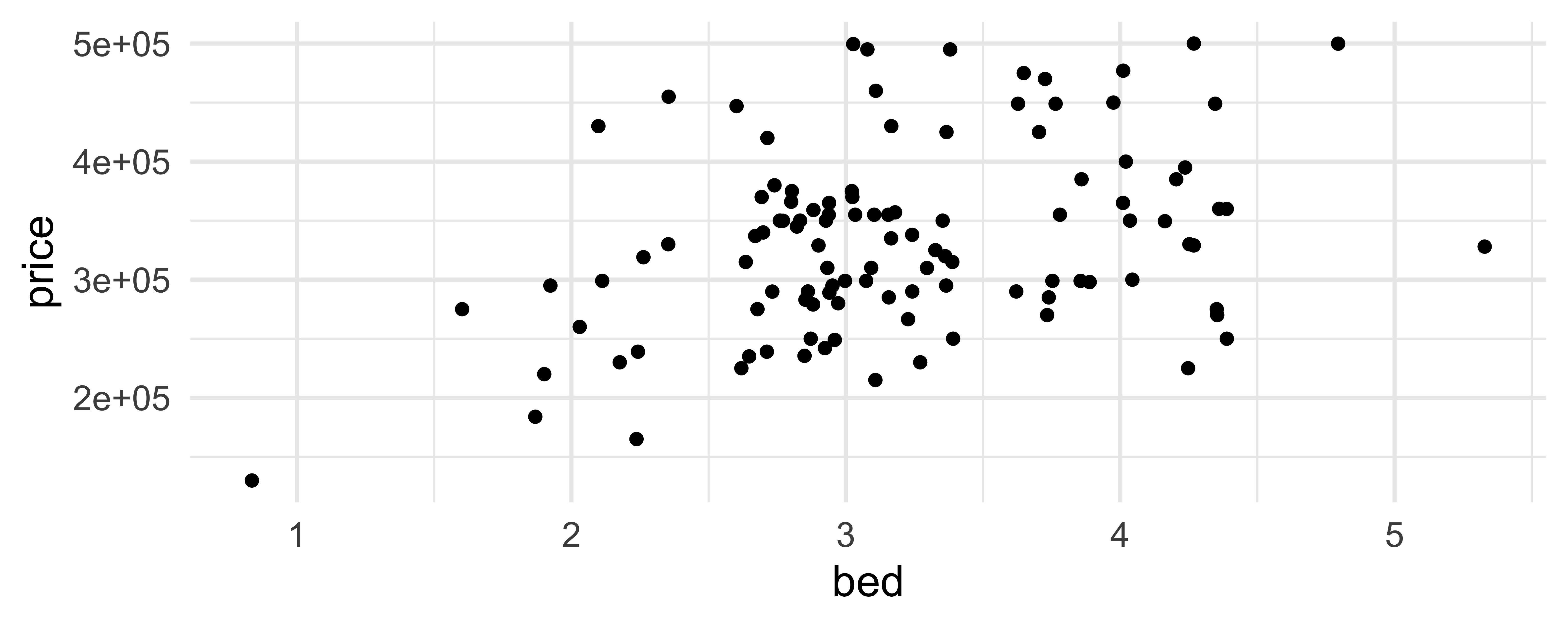
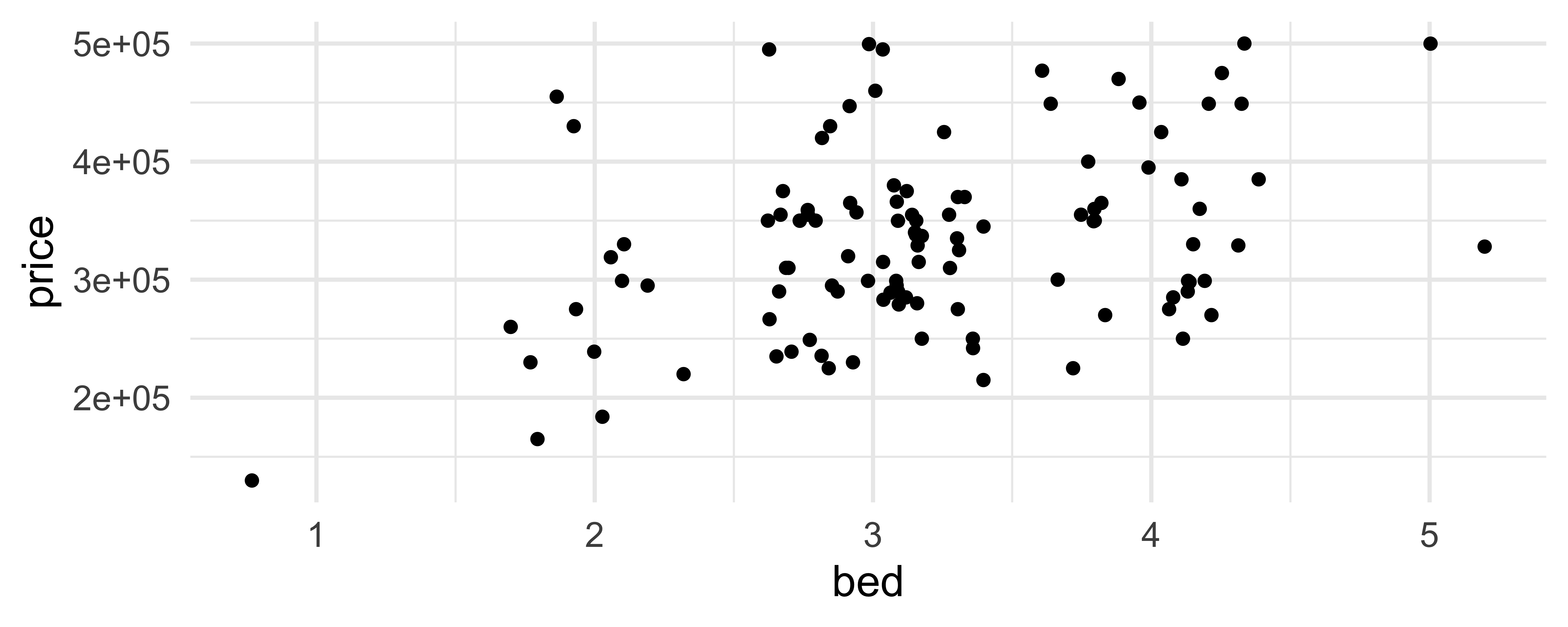
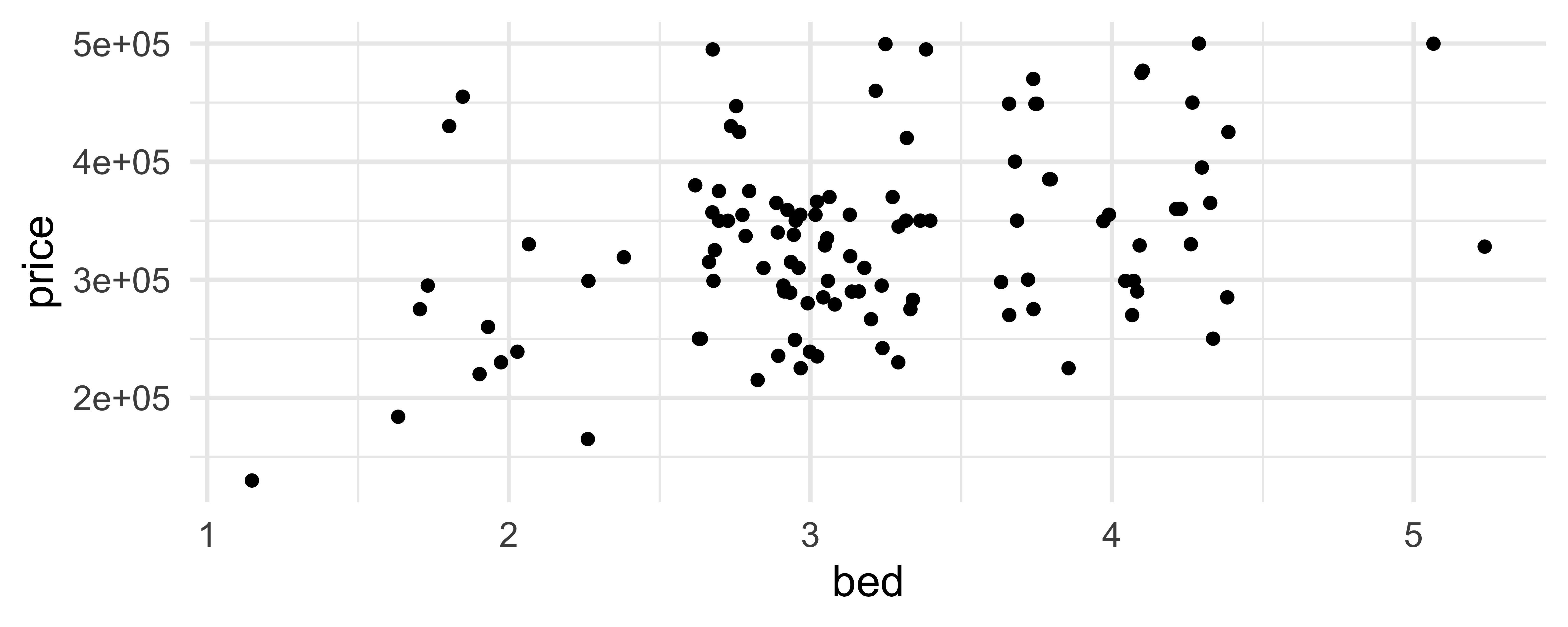
geom_jitter()
How are the following three plots different?
geom_jitter() and set.seed()
Two variables
- One time, one continuous
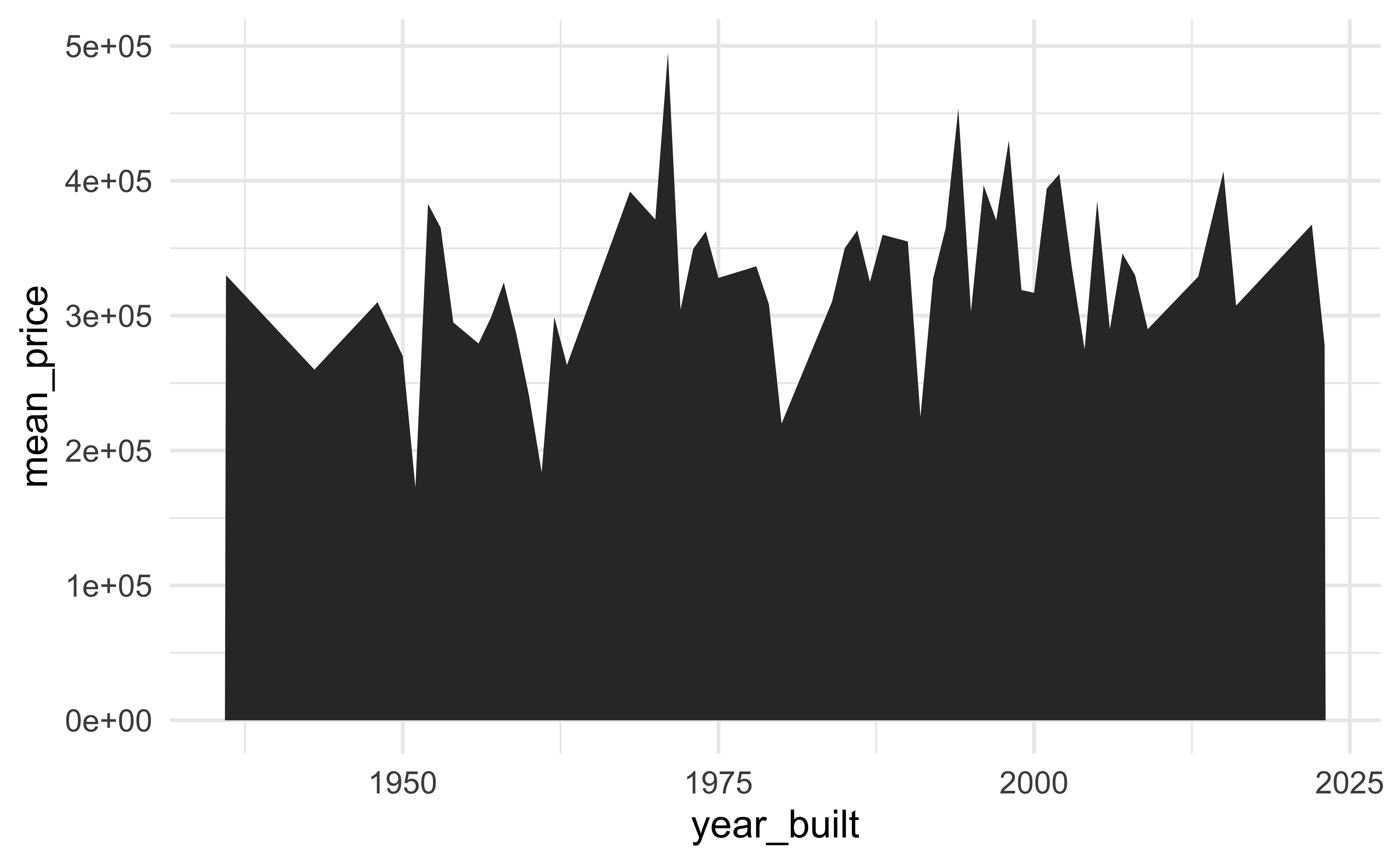
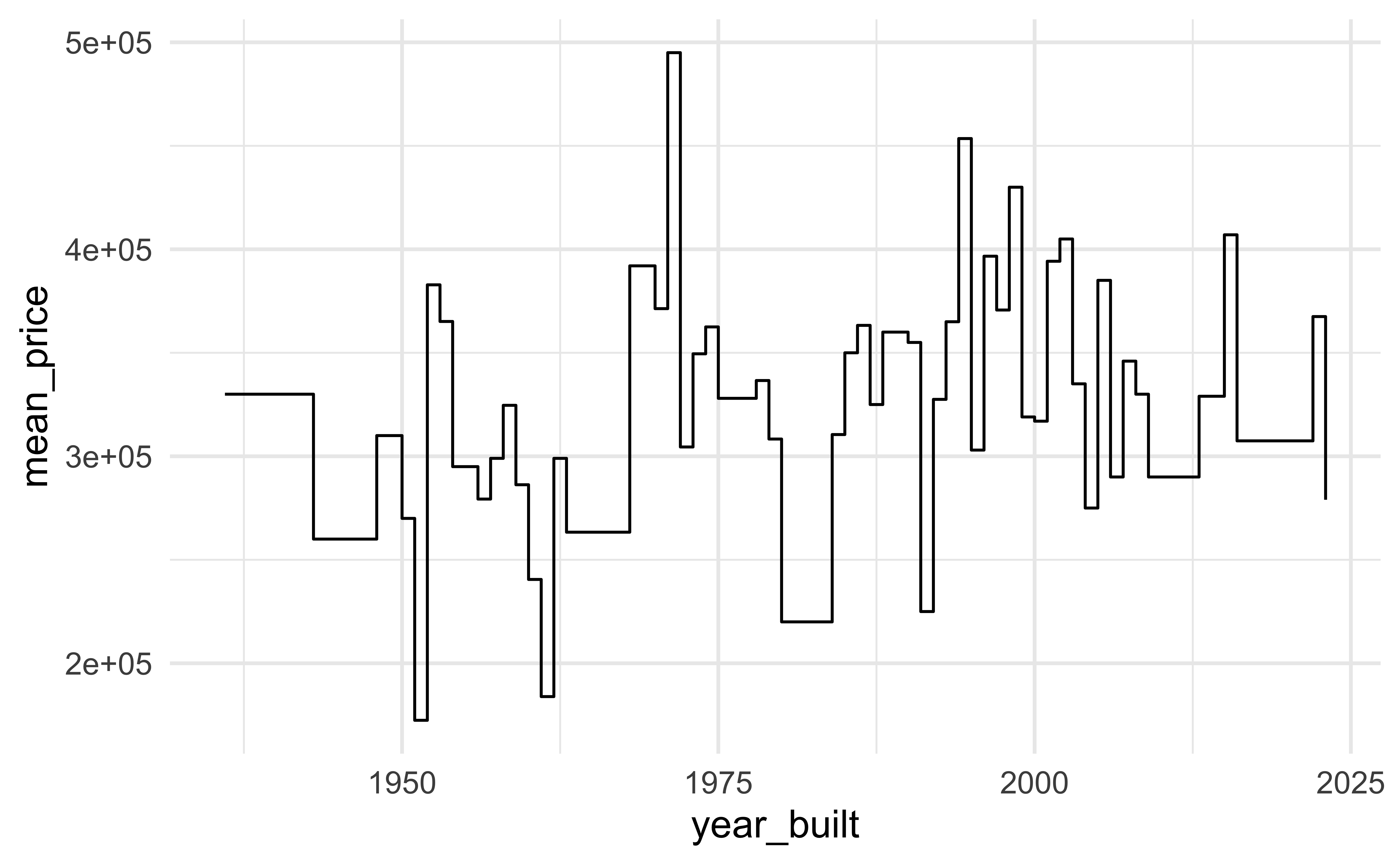
geom_area(): area plotgeom_line(): line plotgeom_step(): step plot
- Display uncertainty:
geom_crossbar(): vertical bar with centergeom_errorbar(): error barsgeom_linerange(): vertical linegeom_pointrange(): vertical line with center
- Spatial
geom_sf(): for map data (more on this later…)
Average price per year built
mean_price_year <- tucsonHousing |>
  group_by(year_built) |>
  summarise(
    n = n(),
    mean_price = mean(price),
    sd_price = sd(price)
    )

mean_price_year
# A tibble: 56 × 4
year_built n mean_price sd_price
<dbl> <int> <dbl> <dbl>
1 1936 1 330000 NA
2 1943 1 260000 NA
3 1948 1 310000 NA
4 1950 2 270000 0
5 1951 2 172450. 60174.
6 1952 3 382833. 104205.
7 1953 3 365133. 132328.
8 1954 1 295000 NA
9 1956 3 279333. 25891.
10 1957 1 299000 NA
# ℹ 46 more rowsgeom_line()

geom_area()
geom_step()
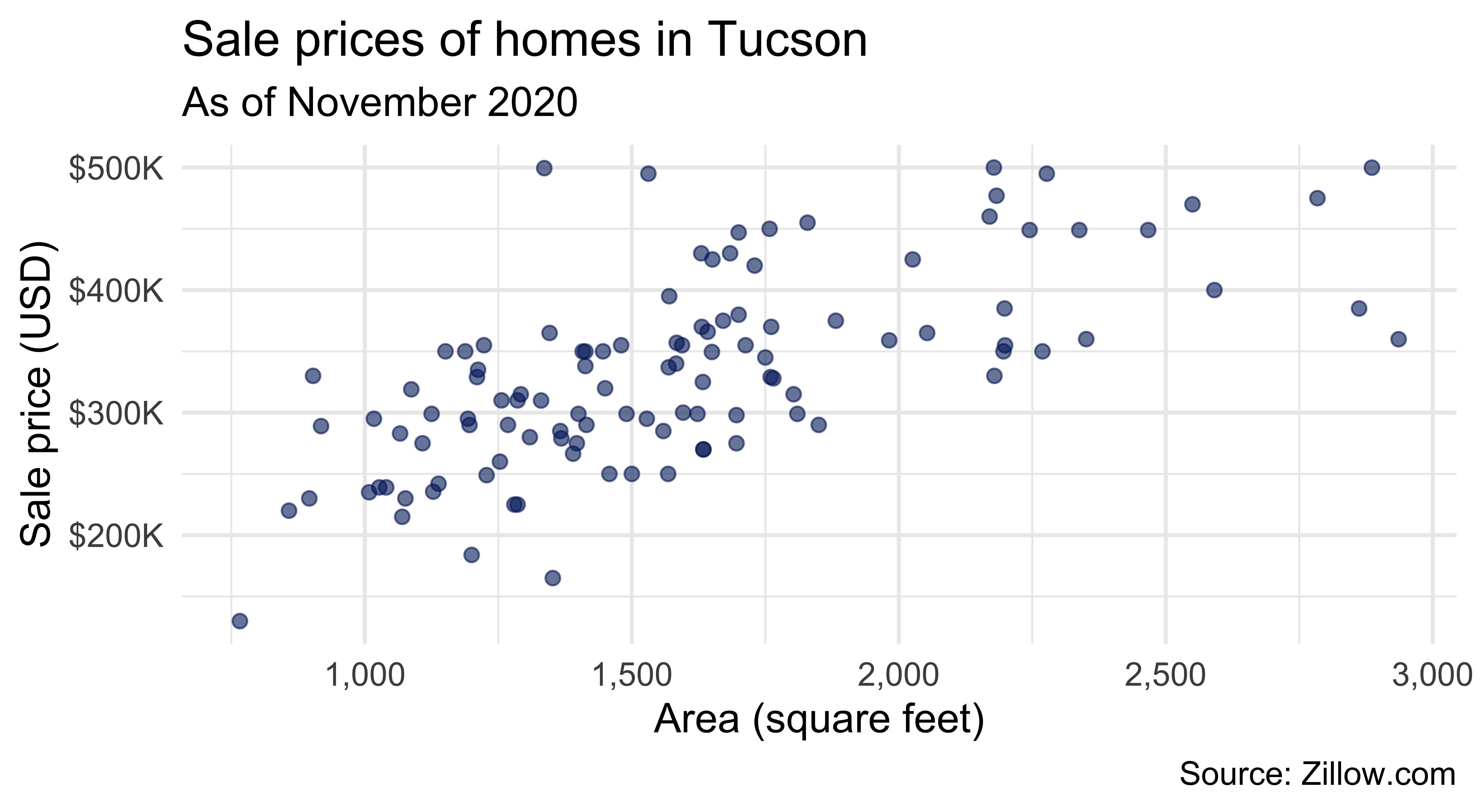
Let’s clean things up a bit!
ggplot(tucsonHousing, aes(x = area, y = price)) +
  geom_point(alpha = 0.6, size = 2, color = "#012169") +
  scale_x_continuous(labels = label_number(big.mark = ",")) +
  scale_y_continuous(labels = label_dollar(scale = 1/1000, suffix = "K")) +
  labs(
    x = "Area (square feet)",
    y = "Sale price (USD)",
    title = "Sale prices of homes in Tucson",
    subtitle = "As of November 2020",
    caption = "Source: Zillow.com"
  )
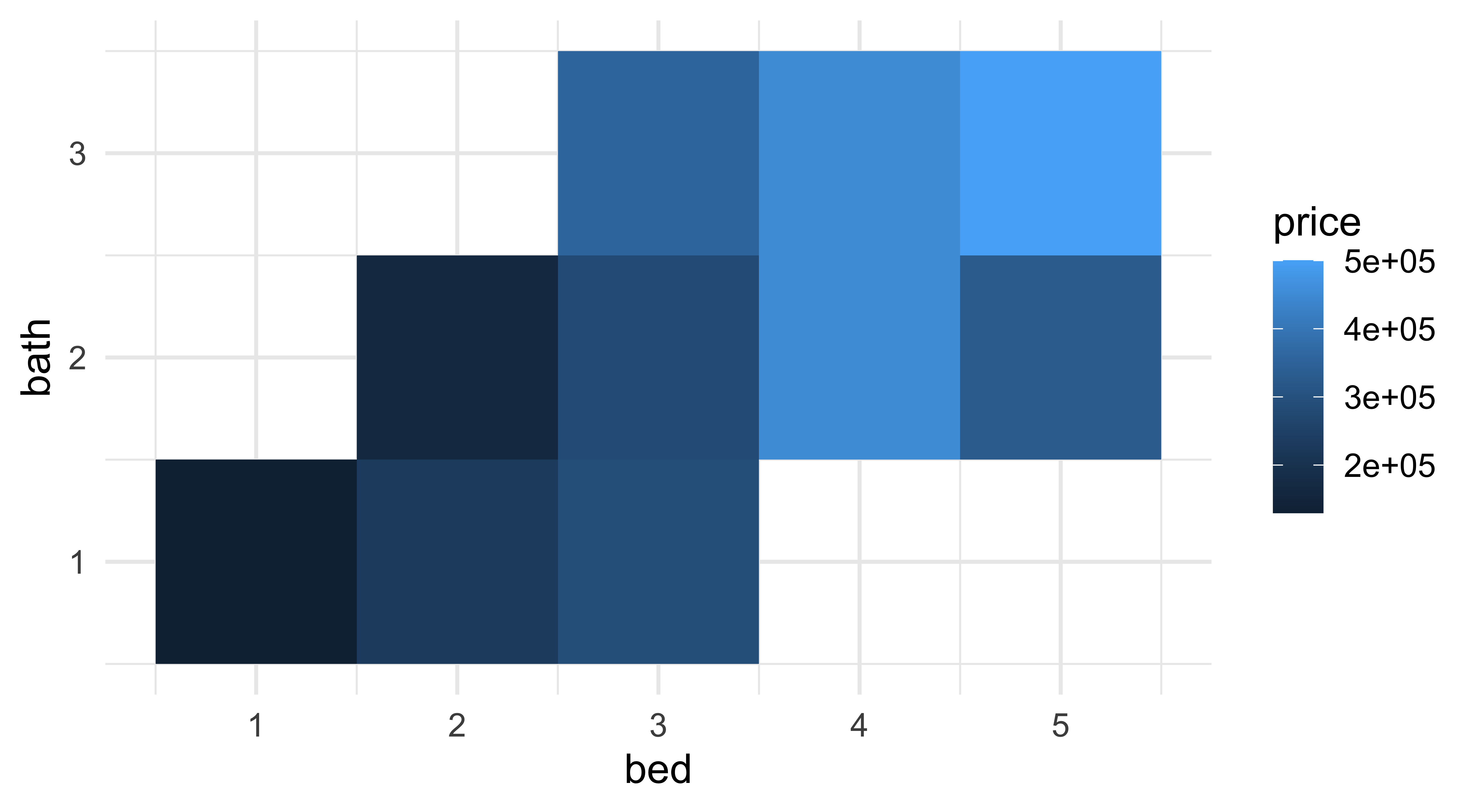
Three variables
geom_contour(): contoursgeom_tile(): tile the plane with rectanglesgeom_raster(): fast version ofgeom_tile()for equal sized tiles
