# load packages
library(tidyverse)
library(glue)
library(scales)
library(countdown)

# set theme for ggplot2
ggplot2::theme_set(ggplot2::theme_minimal(base_size = 14))

# set width of code output
options(width = 65)

# set figure parameters for knitr
knitr::opts_chunk$set(
  fig.width = 7,        # 7" width
  fig.asp = 0.618,      # the golden ratio
  fig.retina = 3,       # dpi multiplier for displaying HTML output on retina
  fig.align = "center", # center align figures
  dpi = 300             # higher dpi, sharper image
)Data wrangling - I
Lecture 3
Dr. Greg Chism
University of Arizona
INFO 526
Setup
Transforming and reshaping a single data frame
Data: Hotel bookings
- Data from two hotels: one resort and one city hotel
- Observations: Each row represents a hotel booking
Scenario 1
We…
have a single data frame
want to slice it, and dice it, and juice it, and process it, so we can plot it
dplyr 101
Which of the following (if any) are unfamiliar to you?
distinct()select(),relocate()arrange(),arrange(desc())slice(),slice_head(),slice_tail(),slice_sample()filter()mutate()summarise(),count()
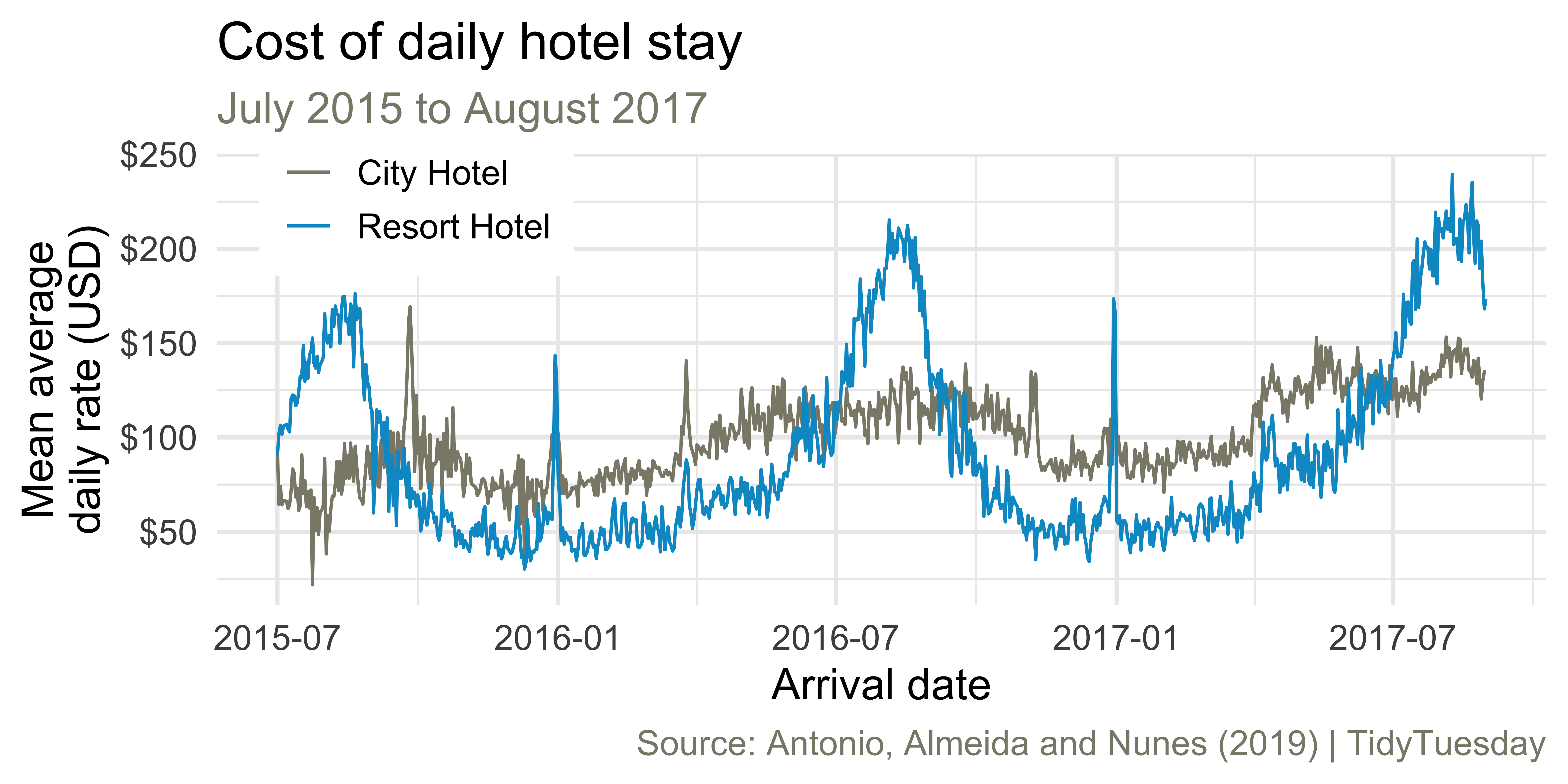
Average cost of daily stay
Let’s recreate this visualization!

Livecoding
Reveal below for code developed during live coding session.
Code
hotels |>
  mutate(
    arrival_date = glue::glue("{arrival_date_year}-{arrival_date_month}-{arrival_date_day_of_month}"),
    arrival_date = ymd(arrival_date)
    ) |>
  group_by(hotel, arrival_date) |>
  summarise(mean_adr = mean(adr), .groups = "drop") |>
  ggplot(aes(x = arrival_date, y = mean_adr, group = hotel, color = hotel)) +
  geom_line() +
  scale_color_manual(values = c("cornsilk4", "deepskyblue3")) +
  scale_y_continuous(labels = label_dollar()) +
  labs(
    x = "Arrival date",
    y = "Mean average\ndaily rate (USD)",
    color = NULL,
    title = "Cost of daily hotel stay",
    subtitle = "July 2015 to August 2017",
    caption = "Source: Antonio, Almeida and Nunes (2019) | TidyTuesday"
  ) +
  theme(
    legend.position = c(0.15, 0.9),
    legend.box.background = element_rect(fill = "white",
                                         color = "white"),
    plot.subtitle = element_text(color = "cornsilk4"),
    plot.caption = element_text(color = "cornsilk4")
  )