# load packages
library(tidyverse)
library(here)
library(countdown)

# set theme for ggplot2
ggplot2::theme_set(ggplot2::theme_minimal(base_size = 14))

# set width of code output
options(width = 65)

# set figure parameters for knitr
knitr::opts_chunk$set(
  fig.width = 7,        # 7" width
  fig.asp = 0.618,      # the golden ratio
  fig.retina = 3,       # dpi multiplier for displaying HTML output on retina
  fig.align = "center", # center align figures
  dpi = 300             # higher dpi, sharper image
)Deep dive into ggplot2 layers - I
Lecture 1
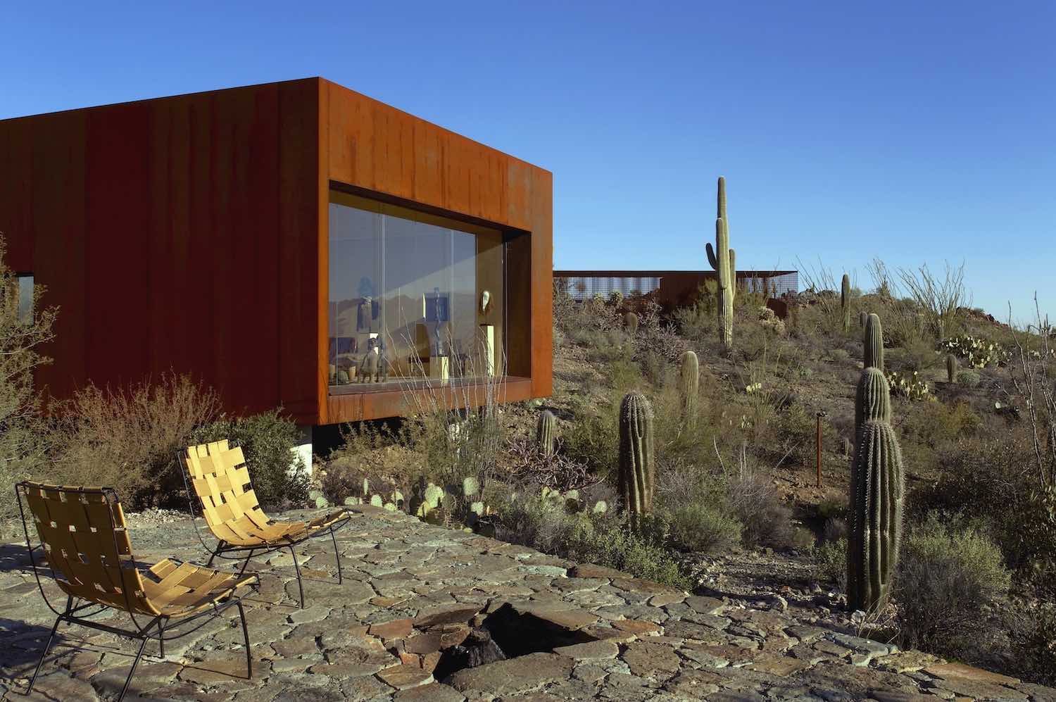
Data: Sale prices of houses in Tucson
Data on houses for sale
in Tucson, AZ, around July 2023Scraped from Zillow
Source:
tucsonHousing.csv
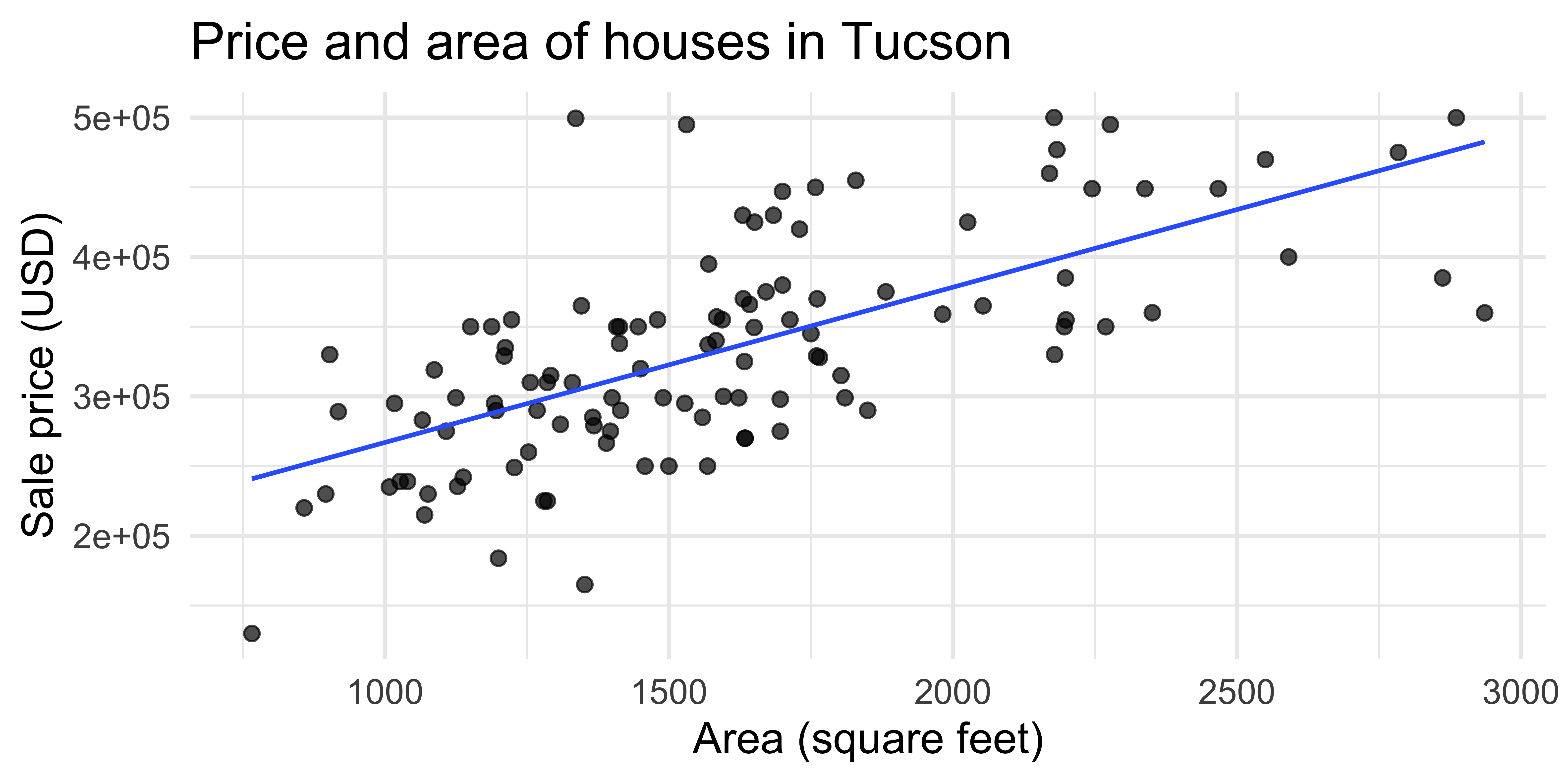
A simple visualization
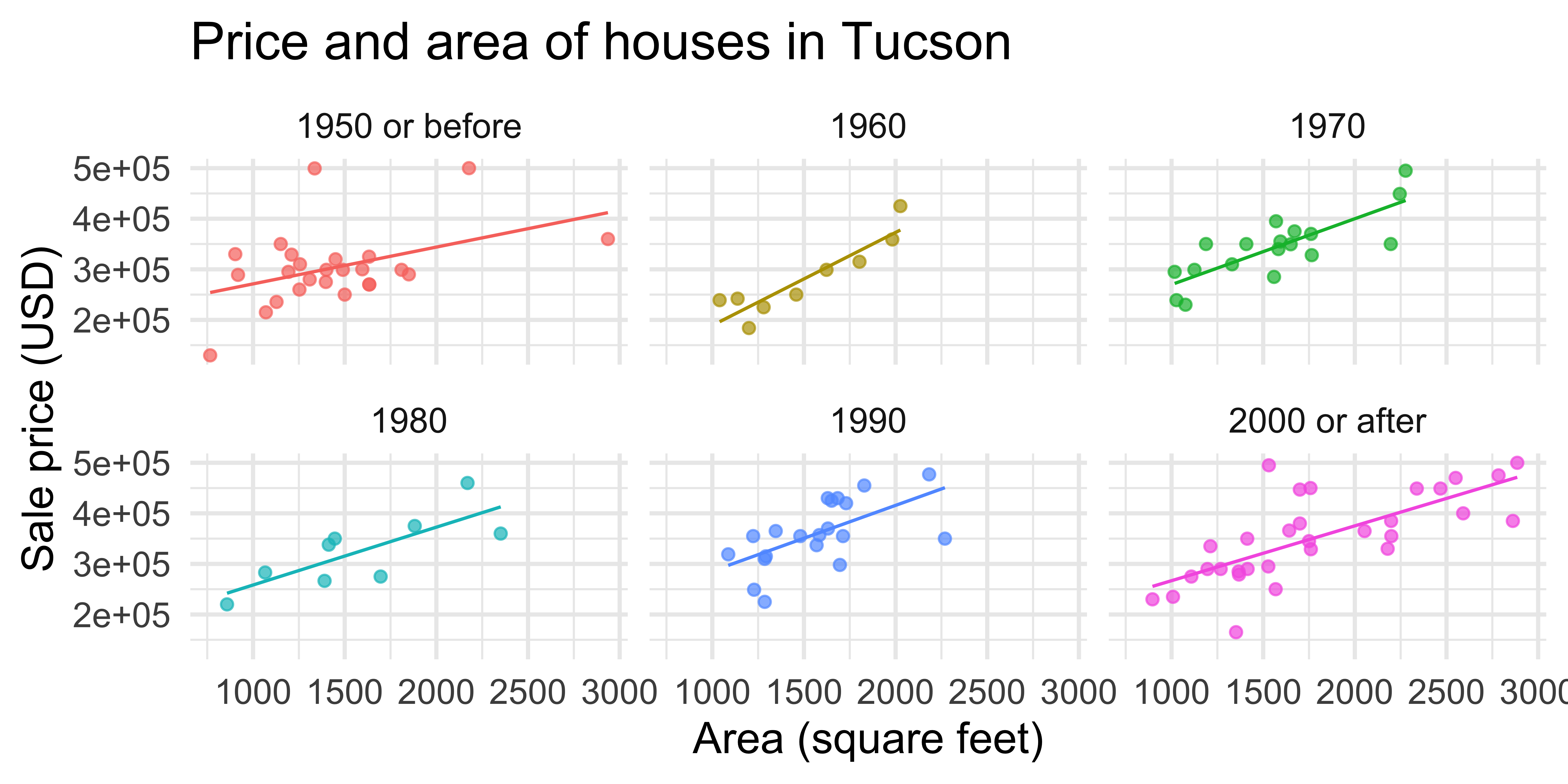
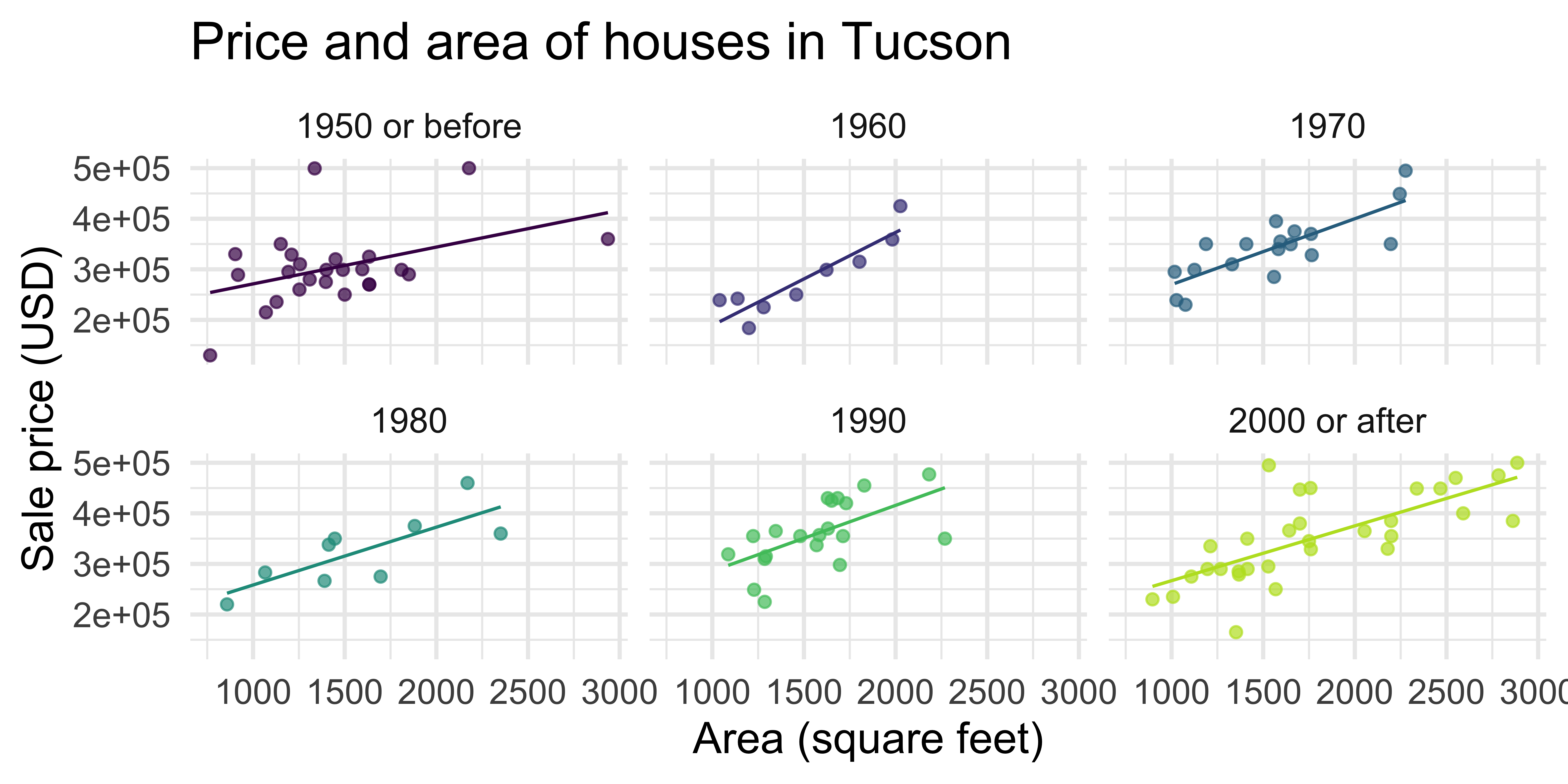
A slightly more complex visualization
ggplot(
  tucsonHousing,
  aes(x = area, y = price, color = decade_built_cat)
) +
  geom_point(alpha = 0.7, show.legend = FALSE) +
  geom_smooth(method = "lm", se = FALSE, size = 0.5, show.legend = FALSE) +
  facet_wrap(~decade_built_cat) +
  labs(
    x = "Area (square feet)",
    y = "Sale price (USD)",
    color = "Decade built",
    title = "Price and area of houses in Tucson"
  )
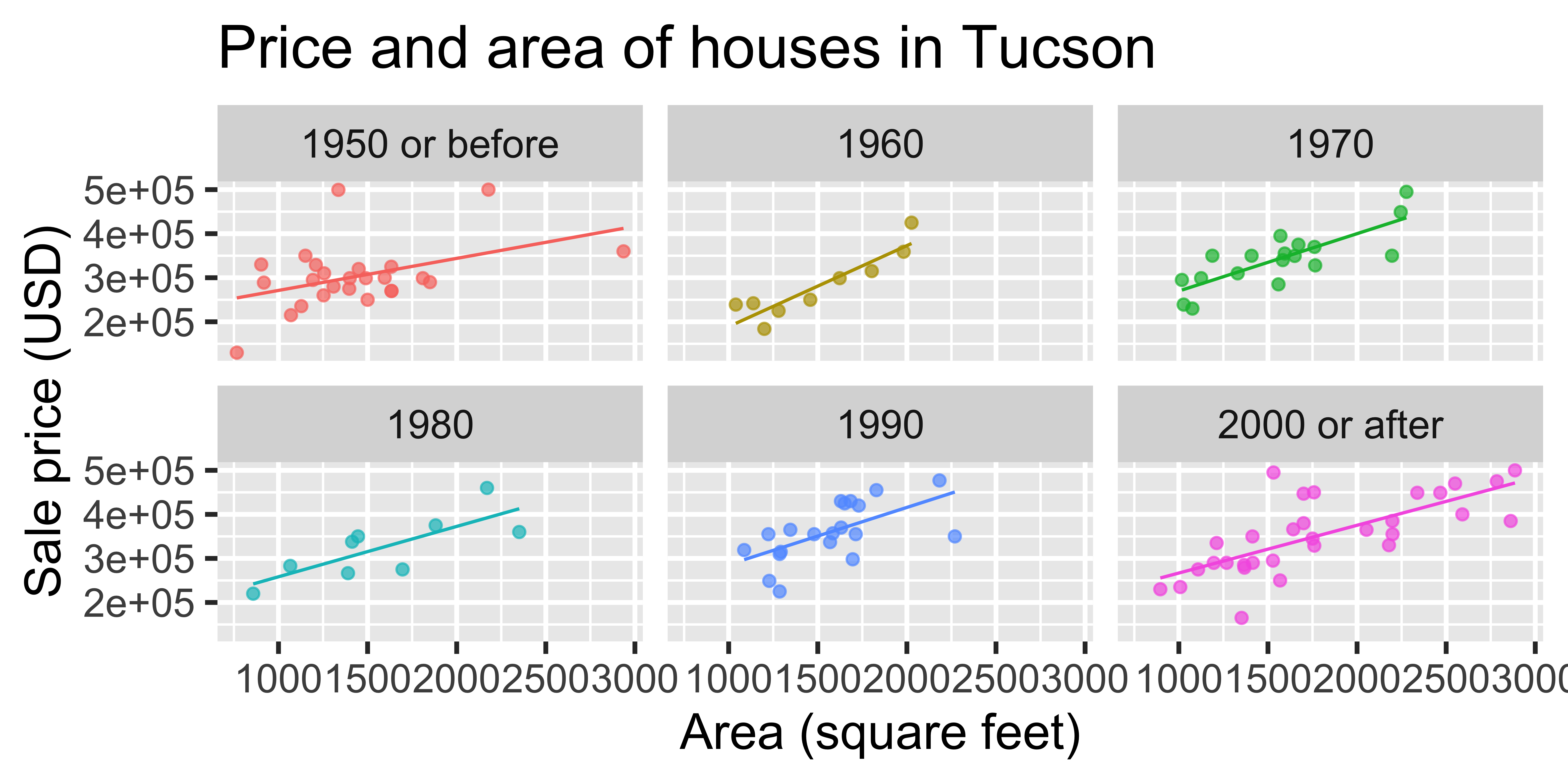
Test 1
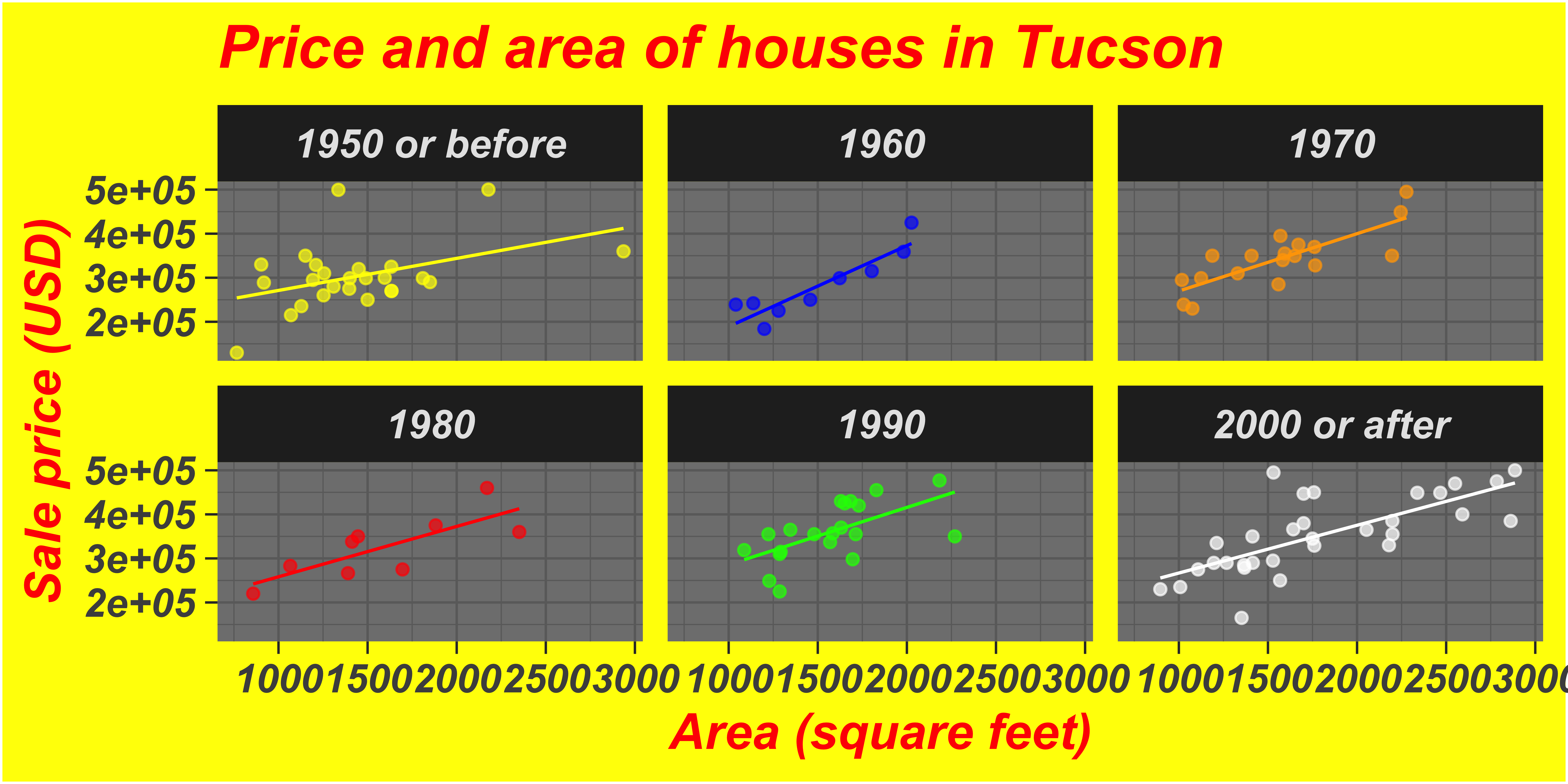
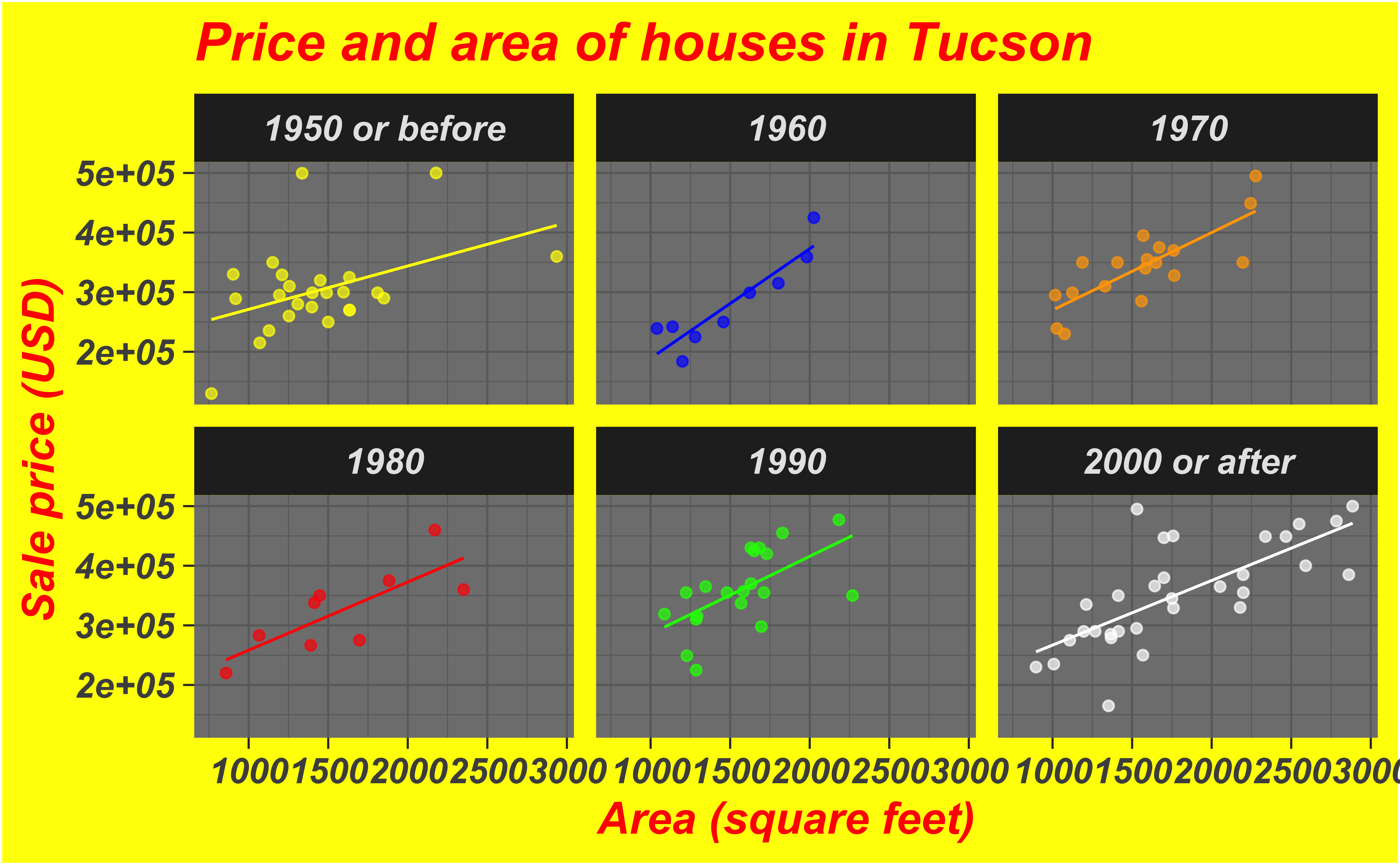
Test 2

Bad taste
Data-to-ink ratio
Tufte strongly recommends maximizing the data-to-ink ratio this in the Visual Display of Quantitative Information (Tufte, 1983).
Graphical excellence is the well-designed presentation of interesting data—a matter of substance, of statistics, and of design … [It] consists of complex ideas communicated with clarity, precision, and efficiency. … [It] is that which gives to the viewer the greatest number of ideas in the shortest time with the least ink in the smallest space … [It] is nearly always multivariate … And graphical excellence requires telling the truth about the data. (Tufte, 1983, p. 51).
Which of the plots has higher data-to-ink ratio?


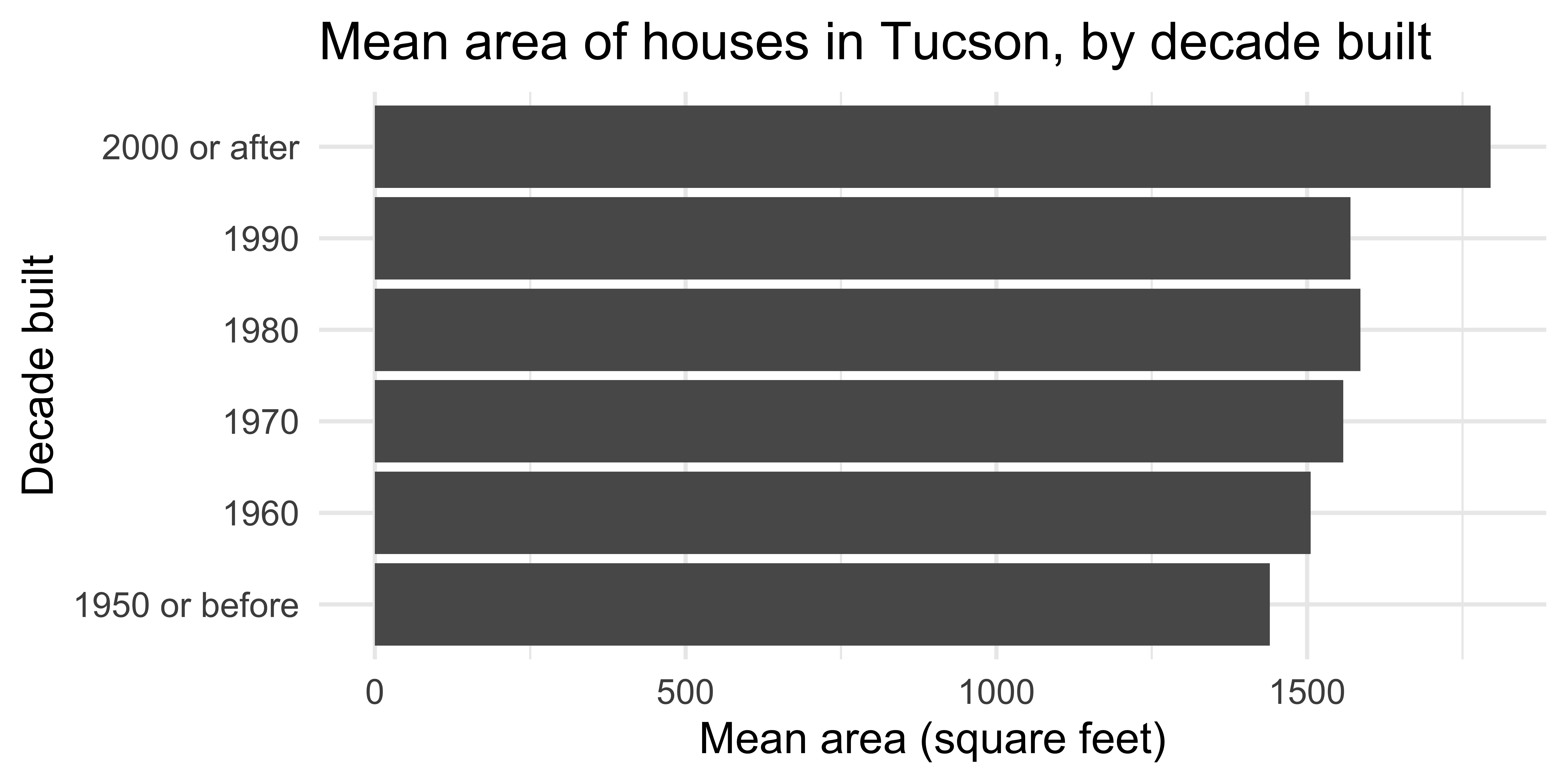
Barplot
Scatterplot
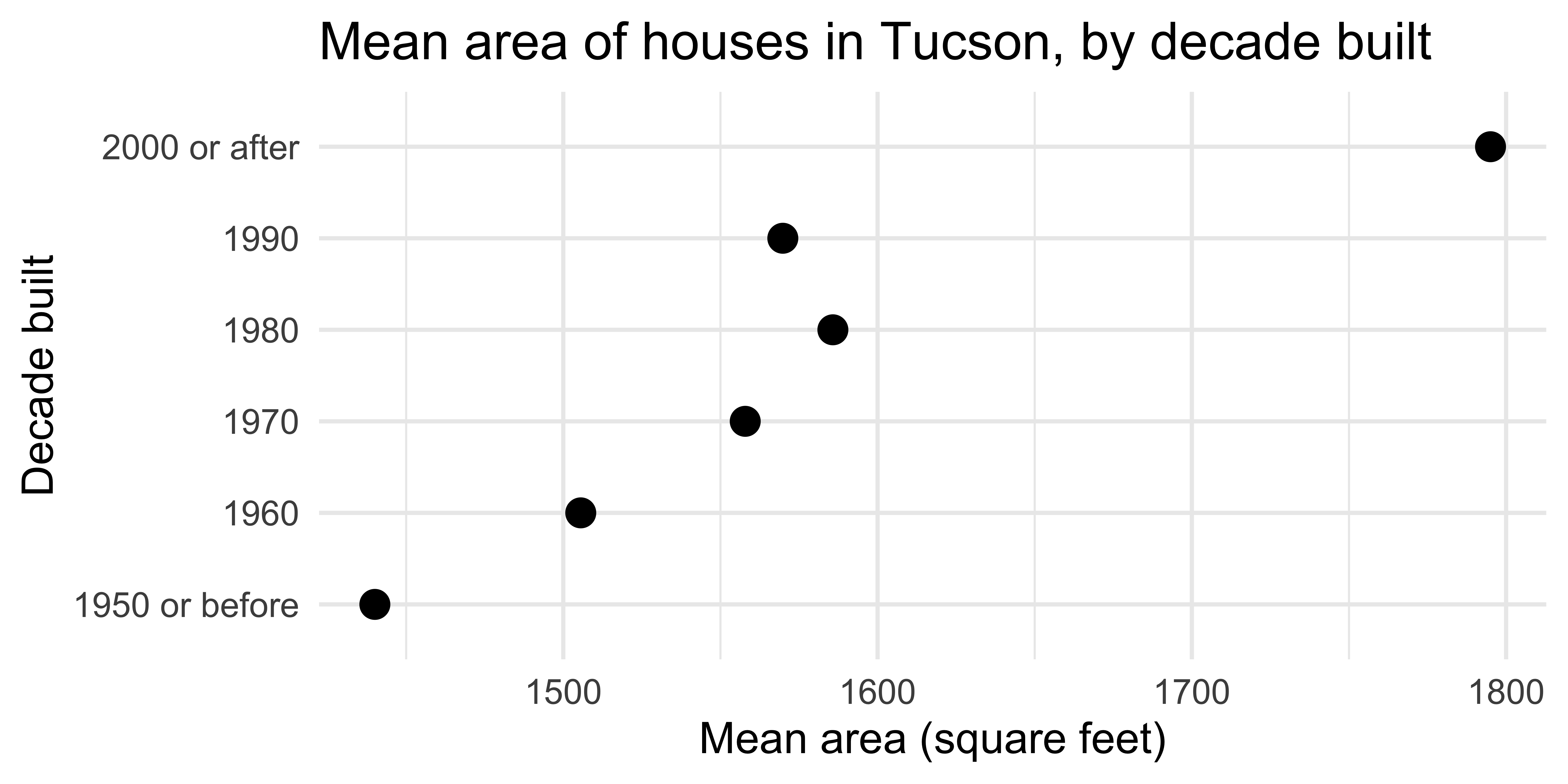
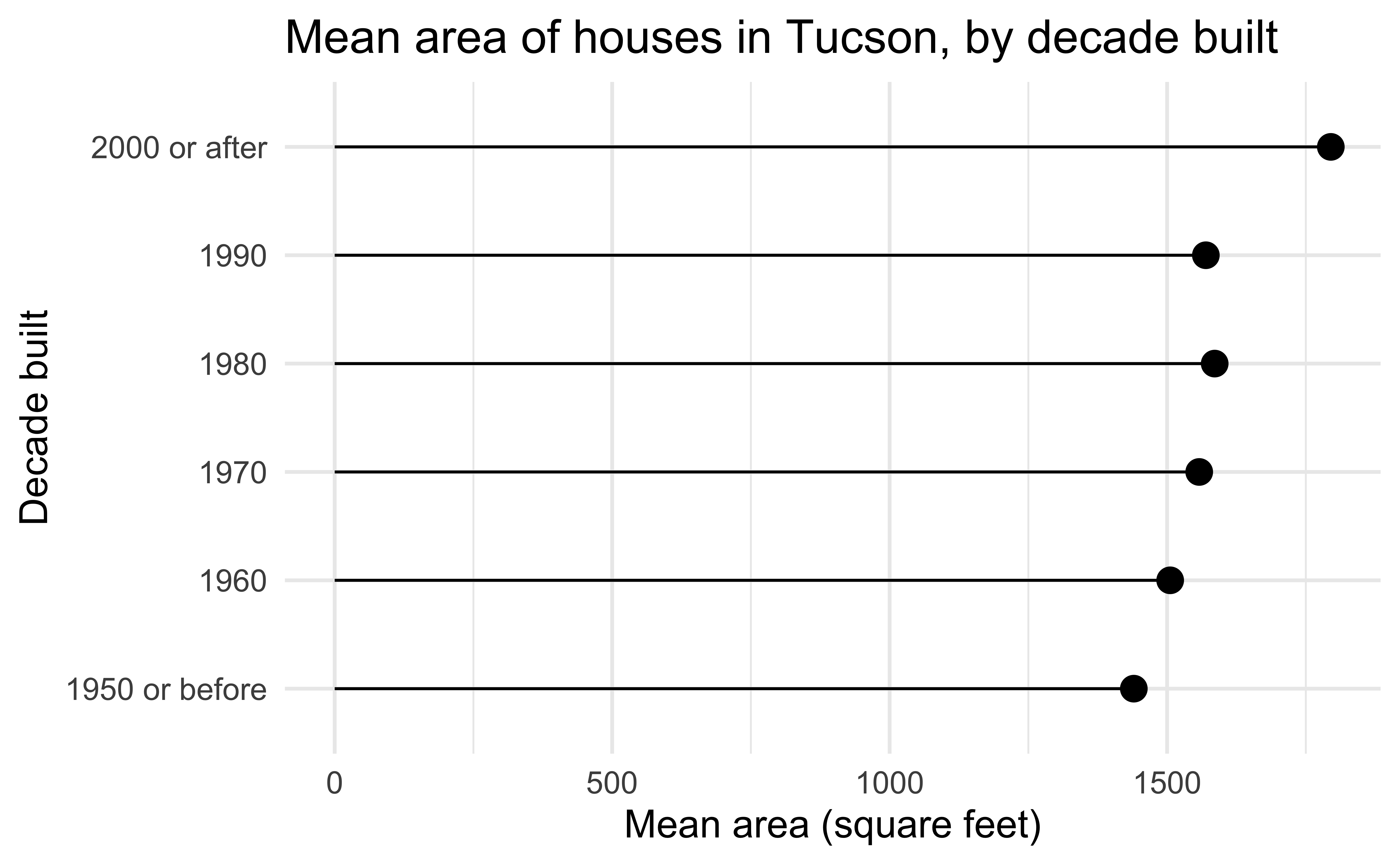
Lollipop chart – a happy medium?
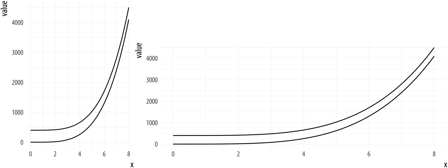
Bad data
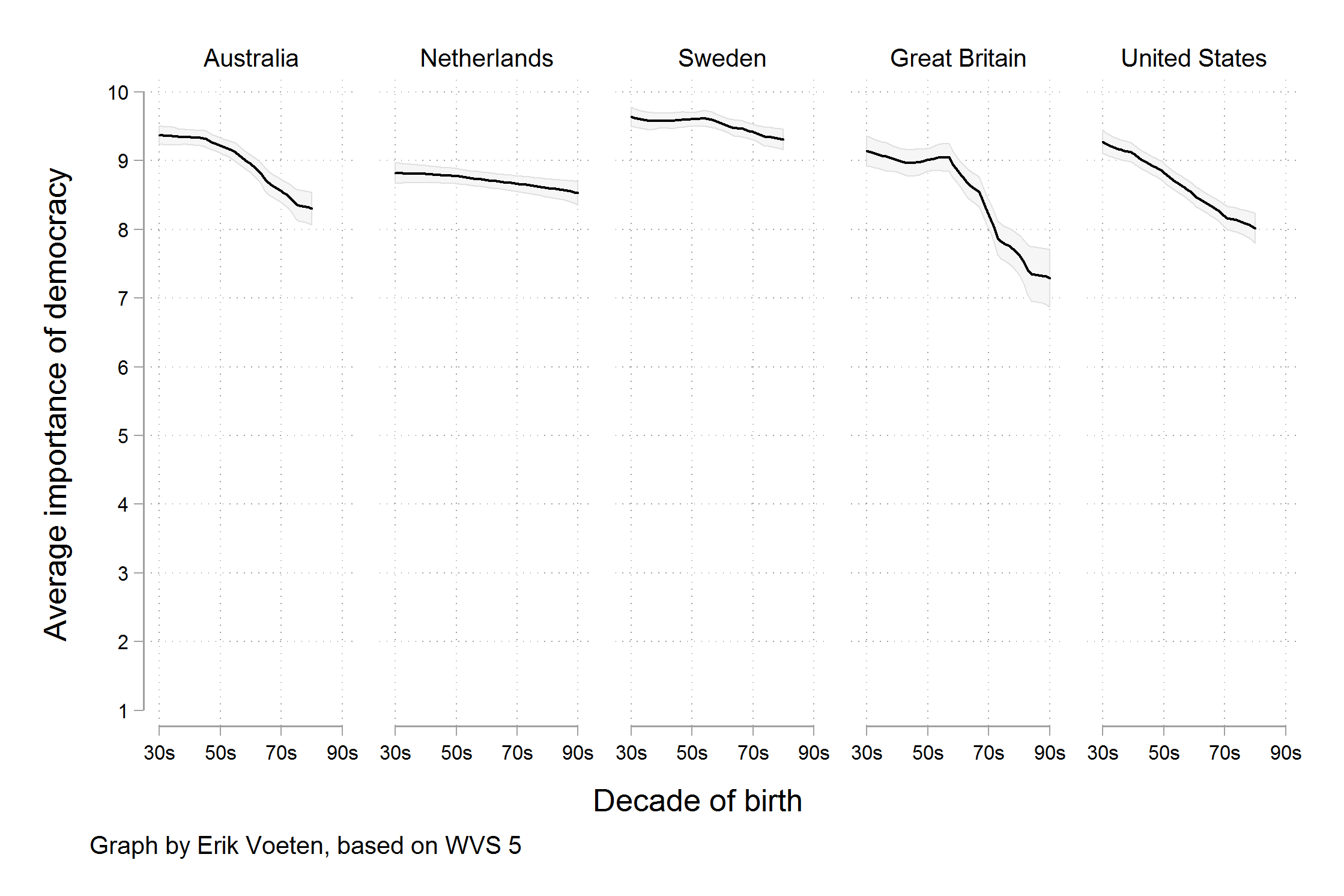
Bad perception
A second look: lollipop chart
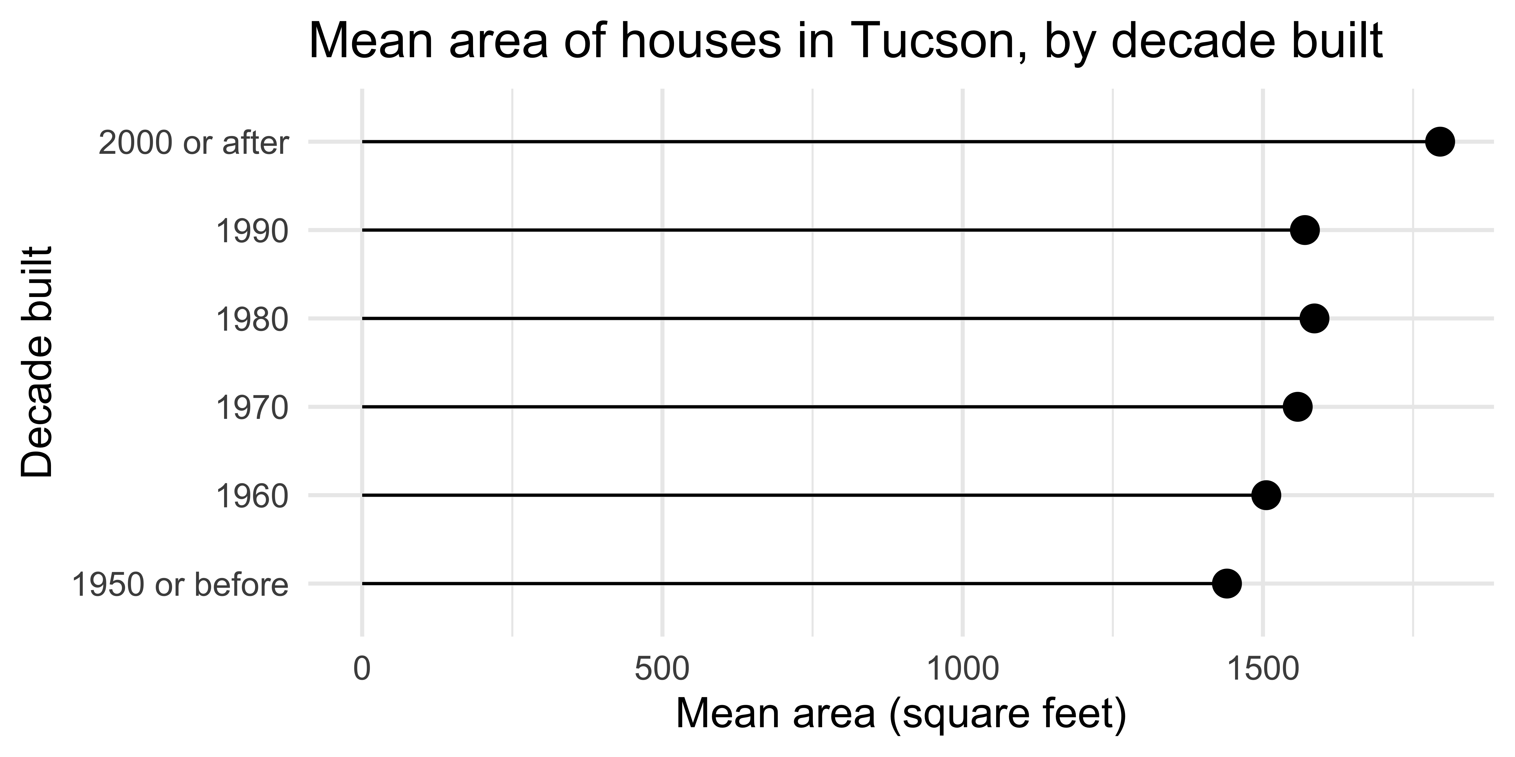
ggplot(
  mean_area_decade,
  aes(y = decade_built_cat, x = mean_area)
) +
  geom_point(size = 4) +
  geom_segment(aes(
    x = 0, xend = mean_area,
    y = decade_built_cat, yend = decade_built_cat
  )) +
  labs(
    x = "Mean area (square feet)",
    y = "Decade built",
    title = "Mean area of houses in Tucson, by decade built"
  )
Activity: Spot the differences |

Can you spot the differences between the code here and the one provided in the previous slide? Are there any differences in the resulting plot? Work in a pair (or group) to answer.