# get a list of files with "Foreign Connected PAC" in their names
list_of_files <- dir_ls(path = "data", regexp = "Foreign Connected PAC")

# read all files and row bind them
# keeping track of the file name in a new column called year
pac <- read_csv(list_of_files, id = "year")Homework 2
For any exercise where you’re writing code, insert a code chunk and make sure to label the chunk. Use a short and informative label. For any exercise where you’re creating a plot, make sure to label all axes, legends, etc. and give it an informative title. For any exercise where you’re including a description and/or interpretation, use full sentences. Make a commit at least after finishing each exercise, or better yet, more frequently. Push your work regularly to GitHub, and make sure all checks pass.
Question 1
A new day, a new plot, a new geom. The goal of this exercise is to learn about a new type of plot (ridgeline plot) and to learn how to make it.
Use the geom_density_ridges() function from the ggridges package to make a ridge plot of of Airbnb review scores of Edinburgh neighborhoods. The neighborhoods should be ordered by their median review scores. The data can be found in the dsbox package, and it’s called edibnb. Also include an interpretation for your visualization. You should review feedback from your Homework 1 to make sure you capture anything you may have missed previously.
(Note: This is not a geom we introduced in class, so seeing an example of it in action will be helpful. Read the package README at https://wilkelab.org/ggridges and/or the introduction vignette at https://wilkelab.org/ggridges/articles/introduction.html. There is more information than you need for this question in the vignette; the first section on Geoms should be sufficient to help you get started.)
Question 2
Foreign Connected PACs. Only American citizens (and immigrants with green cards) can contribute to federal politics, but the American divisions of foreign companies can form political action committees (PACs) and collect contributions from their American employees. (Source: https://www.opensecrets.org/political-action-committees-pacs/foreign-connected-pacs/2020).
In this exercise you will work with data from contributions to US political parties from foreign-connected PACs. The data is stored in CSV files in the data directory of your repository/project. There are 11 files, each for an election cycle between 2000 and 2022. You can load all of the data at once using the code below.
The ultimate goal of this exercise is to recreate yet another plot. But there is a nontrivial amount of data wrangling and tidying that needs to happen before you can do that. Below are the steps you should follow so that you can obtain the necessary interim objects we will be looking for as we review your work.
First, clean the names of the variables in the dataset with a new function from the janitor package:
clean_names(). Then clean and transform the data such that you have something like the following at the end.# A tibble: 2,394 × 6 year pac_name_affiliate count…¹ paren…² dems repubs <int> <chr> <chr> <chr> <dbl> <dbl> 1 2000 7-Eleven Japan Ito-Yo… 1500 7000 2 2000 ABB Group Switze… Asea B… 17000 28500 3 2000 Accenture UK Accent… 23000 52984 4 2000 ACE INA UK ACE Gr… 12500 26000 5 2000 Acuson Corp (Siemens AG) Germany Siemen… 2000 0 6 2000 Adtranz (DaimlerChrysler) Germany Daimle… 10000 500 7 2000 AE Staley Manufacturing (Tate & Ly… UK Tate &… 10000 14000 8 2000 AEGON USA (AEGON NV) Nether… Aegon … 10500 47750 9 2000 AIM Management Group UK AMVESC… 10000 15000 10 2000 Air Liquide America France L'Air … 0 0 # … with 2,384 more rows, and abbreviated variable namesThen, pivot the data longer such that instead of
demsandrepubscolumns you have a column calledpartywith levelsDemocratandRepublicanand another column calledamountthat contains the amount of contribution.Then, For each election cycle (
year) calculate the total amount of contributions to Democrat and Republican parties from PACs withcountry_of_originUK. The resulting summary table should have two rows for each year of data, one for Democrat and one for Republican contributions.Then, recreate the following visualization.
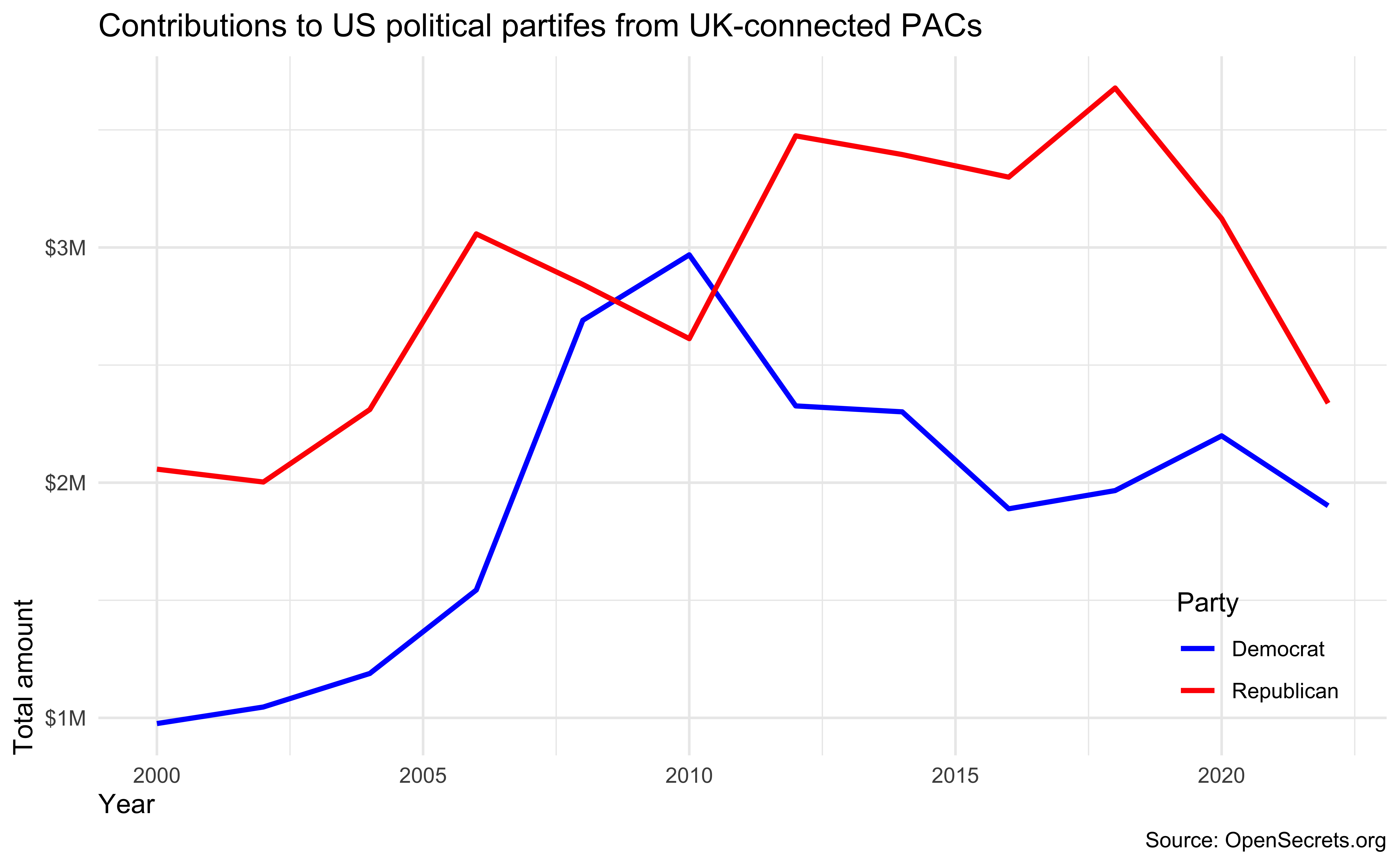
- Finally, remake the same visualization, but for a different country. I recommend you choose a country with a substantial number of contributions to US politics. Interpret the new visualization that you make.
Question 3
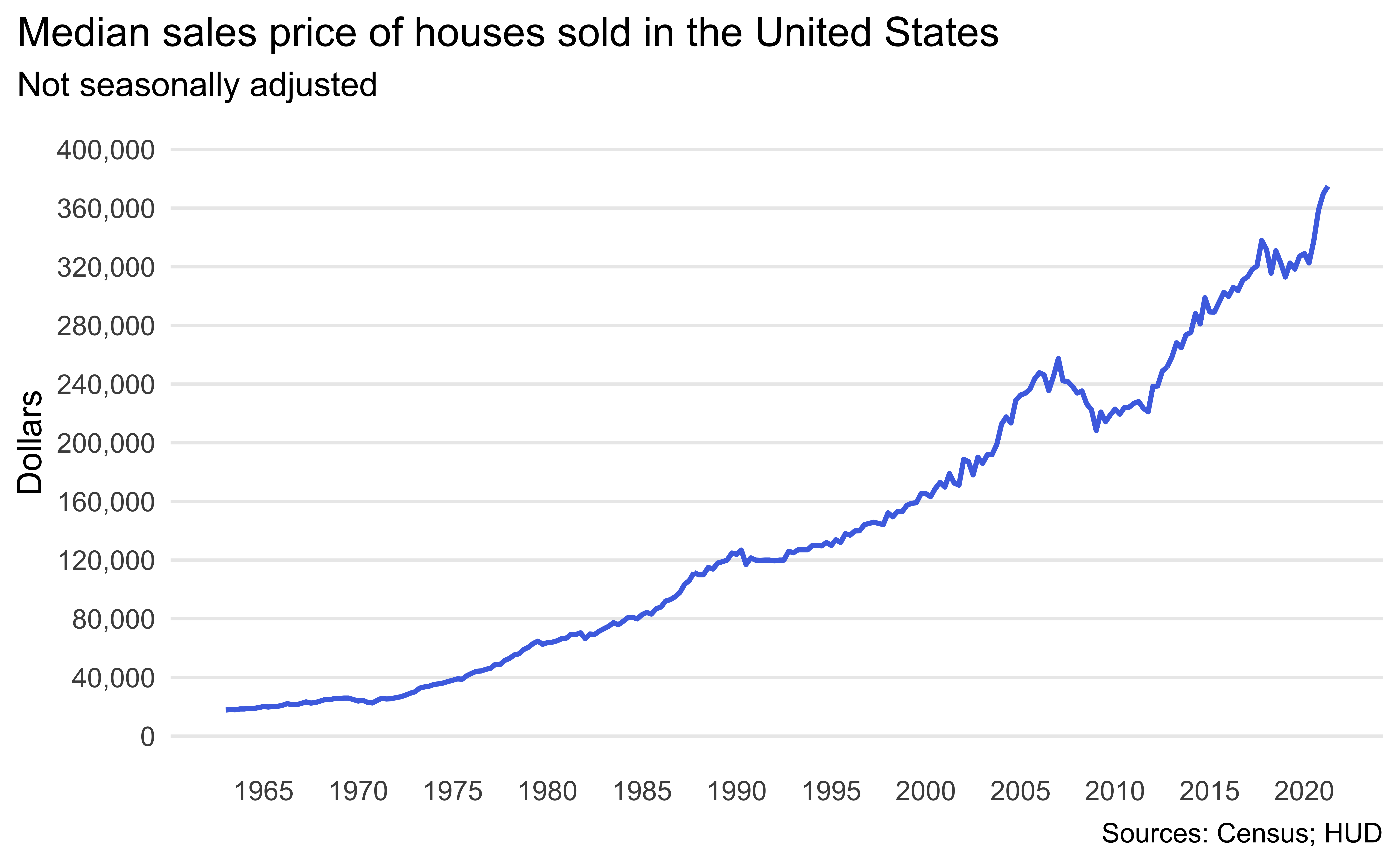
Median housing prices in the US. The inspiration and the data for this exercise comes from https://fred.stlouisfed.org/series/MSPUS. The two datasets you’ll use are median_housing and recessions, both of which are in the data folder of your repository.
Load the two datasets using
read_csv().Rename the variables as date and price.
Create the following visualization.
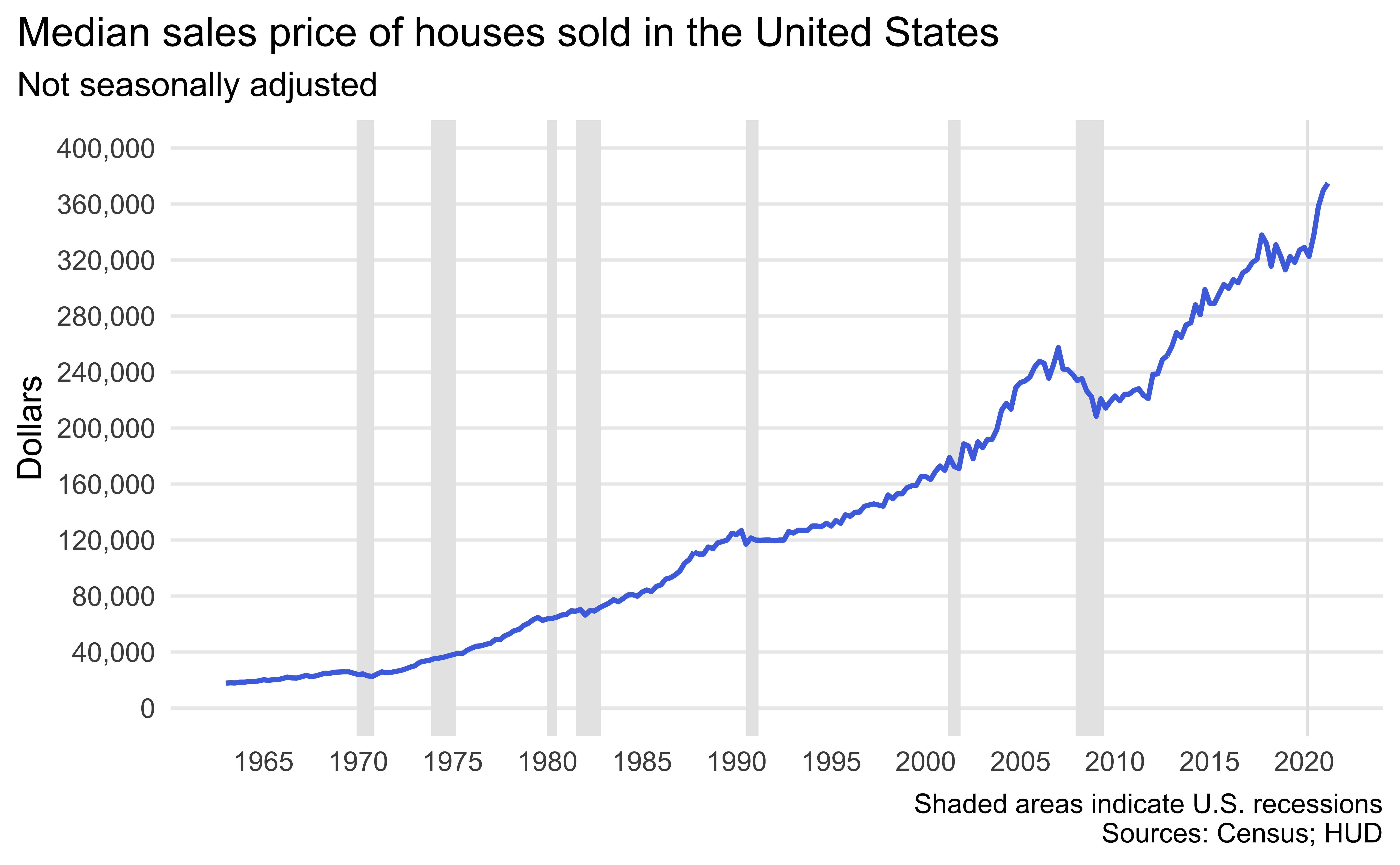
Identify recessions that happened during the time frame of the
median_housingdataset. Do this by adding a new variable to recessions that takes the value TRUE if the recession happened during this time frame and FALSE if not.Now recreate the following visualization. The shaded areas are recessions that happened during the time frame of the
median_housingdataset. Hint: The shaded areas are “behind” the line.
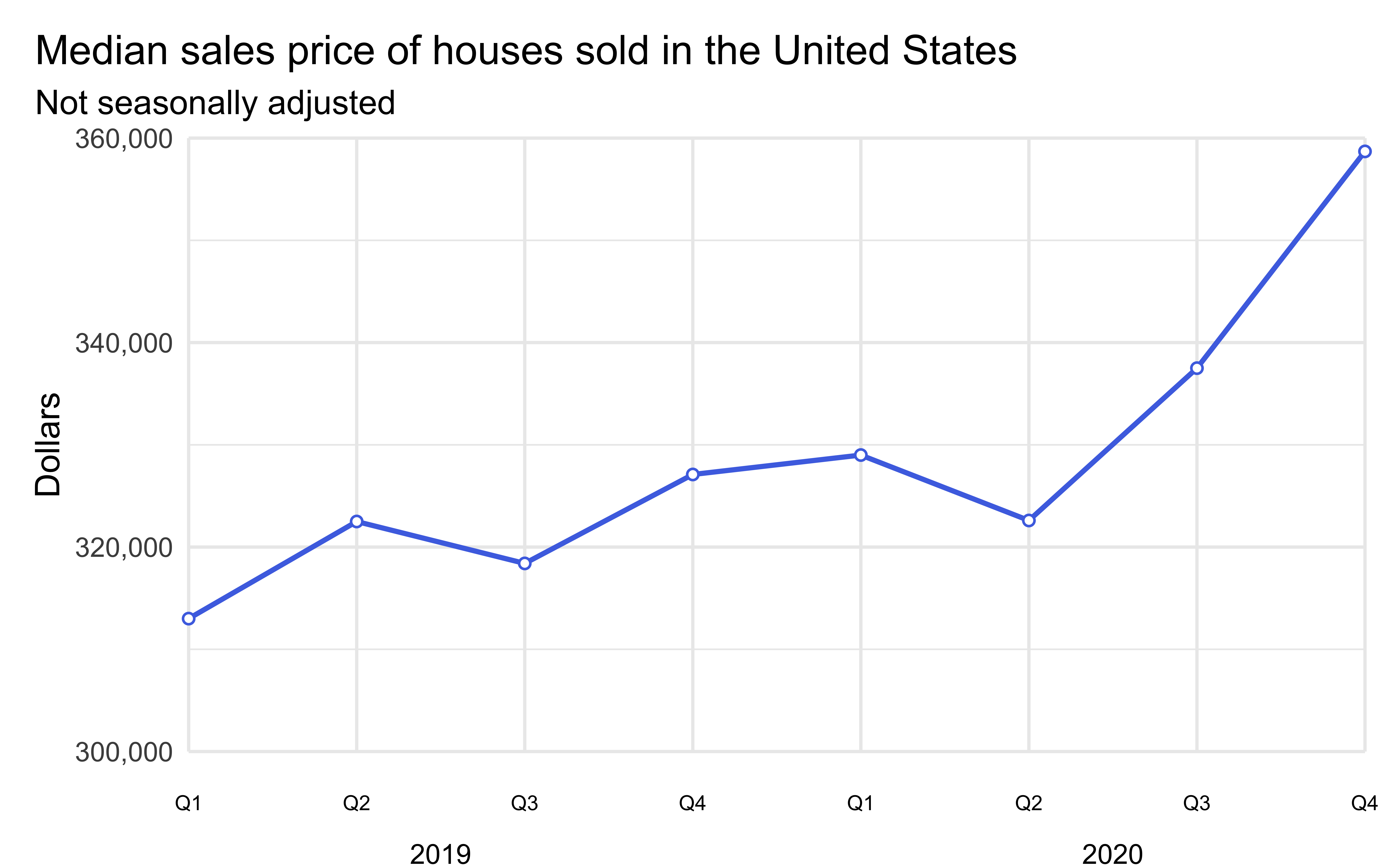
Create a subset of the
median_housingdataset for data from 2019 and 2020 early. Add two columns:yearandquarter.yearis the year of thedateandquartertakes the values Q1, Q2, Q3, or Q4 based ondate.Create the following visualization.
Question 4
Expect More. Plot More. Make the following image (it’s the logo for the retail store Target) using ggplot2. Write a few sentences describing your approach.

Some tips:
I didn’t give you a dataset to plot, you’ll need to make one. Use
tibble()ortribble()to do that again. It really doesn’t matter what you choose to include in that dataset as long as you achieve the final look.The red used in the plot is the “Target red”, you can google and find out what that is. Don’t forget to cite your source for this too!
The registered trademark symbol (R in a circle) can be a bit trickier to figure out. There is a only a very small number of points associated with that component of the plot. So think of it as a “stretch goal” and work on figuring out the rest of the plot first.
The aspect ratio of of your plot in your Quarto document is just as important as the plot. Once you figure out the code to make the plot, knit your document to make sure it looks good in the output of your R Markdown document.
There are many ways you can do this, feel free to discuss with classmates but fight the urge to adopt their approach. Instead, try to come up with your unique one.
Question 5
Mirror, mirror on the wall, who’s the ugliest of them all? Make a plot of the variables in the penguins dataset from the {palmerpenguins} package. Your plot should use at least two variables, but more is fine too. First, make the plot using the default theme and color scales. Then, update the plot to be as ugly as possible. You will probably want to play around with theme options, colors, fonts, etc. The ultimate goal is the ugliest possible plot, and the sky is the limit!