Homework 5
For any exercise where you’re writing code, insert a code chunk and make sure to label the chunk. Use a short and informative label. For any exercise where you’re creating a plot, make sure to label all axes, legends, etc. and give it an informative title. For any exercise where you’re including a description and/or interpretation, use full sentences. Make a commit at least after finishing each exercise, or better yet, more frequently. Push your work regularly to GitHub, and make sure all checks pass.
Question 1
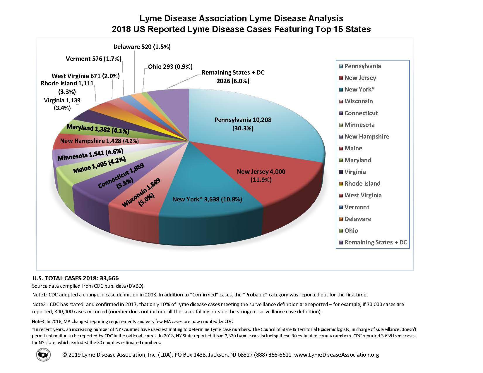
Key lyme pie. The goal of this exercise is to recreate a pie chart in R and then improve it by presenting the same information as a bar graph. The pie chart to be recreate is below and it comes from the Lyme Disease Association. (Source: https://lymediseaseassociation.org/resources/2018-reported-lyme-cases-top-15-states.)

Below are the steps I recommend you follow and some guidance on what (not) to worry about:
First, create the data frame: Use the annotations in the visualization provided to do this. You should create the new data frame using the
tibble()or thetribble()functions.Then, recreate the pie chart: When recreating the pie chart you do not need to
make it a 3D pie chart (2D is sufficient)
match the colors (default ggplot2 colors or any other color palette is fine)
annotate the plot in the same way (just the legend is sufficient)
match the entire caption (see below for what we want you to match)
However you should,
- make a 2D pie chart
- present a legend on the right that shows the mapping of the colors to states
- match the title text, location, and alignment
- match the text, location, and alignment of the first two lines of the caption
Finally, improve the visualization by presenting this information in the form of a bar graph. And as an additional challenge, imagine you’re working for the state of Connecticut, so highlight that bar corresponding to that state in some way. Write a sentence or two describing why you chose to highlight the Connecticut info the way you did.
Use the following prompt for Questions 2-5.
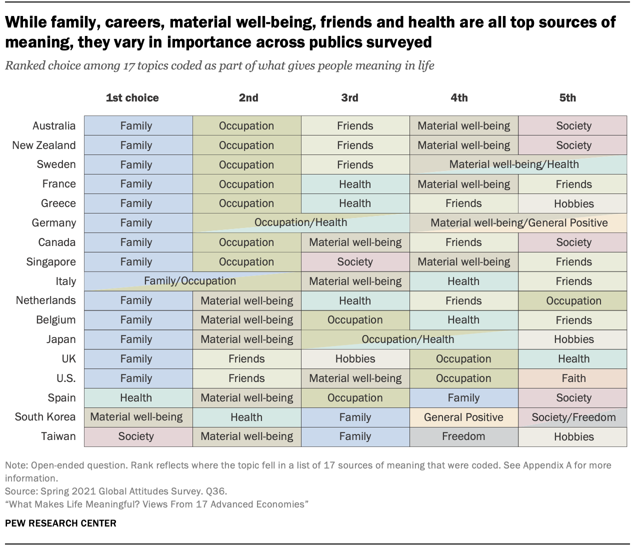
Meaning of life. A 2021 Pew Research survey of 18,850 adults from 17 advanced economies (Canada, Belgium, France, Germany, Greece, Italy, the Netherlands, Spain, Sweden, the United Kingdom, the United States, Australia, Japan, New Zealand, Singapore, South Korea and Taiwan) asked the following question: “We’re interested in exploring what it means to live a satisfying life. What aspects of your life do you currently find meaningful, fulfilling or satisfying?” The results of the survey are summarized in the following visualization, which can be found on Pew’s summary of their findings.

Question 2
The data. Create a dataset based on the data presented in this visualization. You will want to take a peek at the next question, since the dataset you create / how the data are organized will depend on the type of visualization you might make in the next question.
- The code to create the data should go in the
data/data-create.Rfile. - The dataset should be called
life_meaningand saved aslife_meaning.csvin the data folder.
Question 3
The visualization. Create an alternative visualization of these data. Accompany your visualization with a brief explanation of how you decided to create what you created, as well as how it is similar to and how it differs from the original visualization. It’s OK if your visualization is such that all the conclusions that can be drawn from the original visualization can’t be drawn from yours (e.g., maybe fewer choices per country are displayed), but this should be something you articulate in your answer along with a justification with why you think it’s OK to omit this feature. Make sure that your visualization employs accessibility best practices we’ve discussed in class, and write a sentence about features you’ve decided to include/omit to meet these guidelines. The code to make the visualization should go in your Quarto file (as usual).
Question 4
The app. Create a Shiny app that features the visualization you made and at least one reactive element. The reactivity can be as simple as selecting a country to highlight. Deploy the app to shinyapps.io.
- The code of the app should go in the
app1folder. - The link to the deployed app should be included in your R Markdown folder.
- If you have a dataset you’ve created and placed in the
datafolder in the root of your project/repo, move that data file into theapp1/datafolder. You need everything needed to run the app in theapp1folder for deployment. This creates multiple copies of the data in your repo, but that’s ok. If you don’t have a dataset - Note: You’ve learned about Shiny in class, but we haven’t covered deployment, so completing this question will require a bit of self-learning. See this article on deployment for instructions) for instructions for deployment to shinyapps.io, and ask questions if you need further guidance!
Question 5
The styled app. Change the look of your app using the theming features and the auto-theming option offered by the thematic package. This will allow the look of your app to match the look of your visualization. Deploy the app to Shinyapps.io.
- The code of the app should go in the
app2folder. - The link to the deployed app should be included in your R Markdown folder.
